

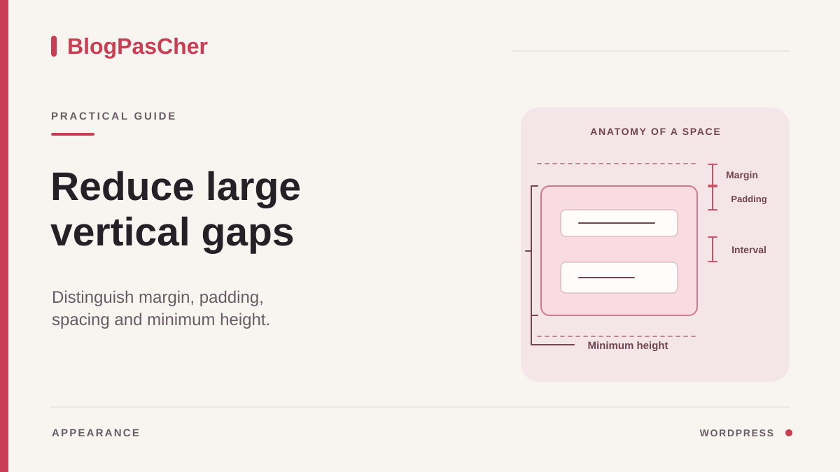
Identify the boundaries of the empty space
A services page may have a large blank area between its heading and first image, while the gaps between other sections are consistent. Note the two elements bordering this space and compare them on the public page and in the editor. If the gap appears before the heading on every page, investigate the template. If it affects only one banner, start with the blocks in that section.
Take one screenshot in a wide window and another on a phone or in a narrow window. Estimate the gap and identify the area’s background color. If the banner background extends into the empty space, first look for padding or a height setting on the banner. If the background ends well before the next block, examine margins and container spacing instead. This clue helps when several groups are nested.
Open Pages > All Pages or Posts > All Posts, then Edit. Check the title and selected document. Keep a page with vertical spacing you like open as a reference. It will give you a concrete basis for choosing a fix. A reasonable gap between two paragraphs may be too small between two large sections. Compare elements serving the same purpose.
Run your experiments in a draft or working copy if the page is important. For every setting tested, record the block, side, value and unit. An empty value may use a theme setting, whereas an explicit zero removes the space at that level. This distinction matters when restoring the original state.
Look for a block occupying the area
Open List View at the top of the editor and expand the groups between the two elements you identified. Look for a Spacer block, an empty paragraph or a container whose content was removed. Select each candidate in the tree. Its outline in the editing area shows whether it actually occupies the space. Expand a group’s children before deciding to delete it. An inconspicuous area may contain dynamic information, an anchor or a block displayed only under certain conditions.
If you find a Spacer block, note its height and reduce it in its settings. An old spacer added to compensate for a previous layout can sometimes be deleted. Delete it through the selected block’s options, then check List View to make sure neighboring blocks are still there. Repeatedly pressing Backspace in the text could merge paragraphs or remove another element.
For an empty paragraph, check that its Advanced panel does not contain an anchor used by an internal link. Also consider its role in the layout. If it is purely decorative and unnecessary, delete it, then check the page and any table of contents. If a link targeted it, first move the anchor to the appropriate block and test that link.
If no element fills the gap, select the two neighboring blocks and then their common parent. Note which one encloses the whole area. Next, examine the dimensions of these three candidates. This approach avoids adding another Spacer block to fix a distance already created by the structure.
Adjust margins and padding in the right place
Select one of the neighboring blocks and open Settings > Block > Dimensions, usually in the Styles area. The section’s three-dot menu may reveal additional controls. Look for Margin, which acts outside the block, and Padding or internal spacing, which creates distance between its content and border. The interface shows only options supported by the block and theme in use.
Consider a section whose colored background starts well above its heading. Select the group with that background and inspect its top padding. If the sides are linked, unlink them before reducing only the top. Keep the side padding that stops text from touching the edges. Previewing this single change lets you see whether the top moves closer to the heading without making the text harder to read across the width.
If the gap lies between two groups whose backgrounds have ended, examine the bottom margin of the first and the top margin of the second. Test one before the other. The actual result may depend on the layout and theme rules. Two numbers visible in a panel do not always predict the final distance. If the first experiment has no effect, restore the value and examine the neighboring block or their parent.
When an old local value is responsible, compare removing it with specifying a smaller value. Removing it allows the theme or parent to supply any applicable setting. An explicit value may suit an exception. Also inspect the result immediately after the section, because a setting applied to both sides can change a gap that was already satisfactory.
Reduce the gap between a group’s children
If all the elements in a section seem too far apart, select their parent group in List View. Look for Block Spacing in Dimensions or layout settings. This control sets the gap between the container’s direct children. A group containing a heading and a subgroup therefore has only two children at that level, even if the subgroup contains four paragraphs. To adjust the spacing between those paragraphs, select the subgroup.
Compare the gaps before and after changing the setting by one increment. Check the entire section. A reduction may improve the distance between the heading and description while bringing buttons at the end of the section too close together. If only two elements need a different gap, examine their structure and local settings before applying a shared change to all their neighbors.
In a row or grid, the control may affect more than one axis. Check the gap between cards side by side and the gap that appears when they wrap onto several rows. If the control distinguishes the axes, adjust the vertical one. If it offers a shared value, choose one that remains acceptable in both directions, or try a layout with separate axes on a copy. Preserve the blocks’ reading order during this experiment.
Also compare the bottom of the container with the start of the next section. Container padding and the gap between its children serve different purposes. If the distance between the two sections remains large even though the internal spacing is now good, undo any additional spacing change and look for margins or padding on the neighboring groups.
Check a minimum height or Cover block
A decorative cover may retain a large height even when a heading and two lines of text are enough. Select the Cover block or group enclosing the area and open Dimensions. Look for Minimum Height if the block provides it. Record the value, unit and content position. A height tied to the viewport, such as a value in viewport-height units, may reserve a large part of the screen before the next content.
Reduce this height gradually and check the image crop, text position and visibility of the next action. If the banner needs to grow with longer text, try leaving the minimum height empty while keeping enough padding. The block can then adapt to its content and theme. A cover designed to fill the entire screen calls for a different decision. Check that this height still serves the page’s purpose.
For a vertical group, also examine its layout and element distribution. A setting that pushes the first and last child apart may create a large internal gap when the container remains tall. Test the height before the distribution, keeping a record of both settings. If the block is near the footer, check that it is not intended to keep the footer lower on short pages.
On a phone, check a page with little text and another whose heading spans several lines. A reduced height may allow the text to grow while cropping a background image differently. Adjust the crop in the same place, then check that the dark or light area behind the words still provides enough contrast.
Examine the template and shared styles
If the gap appears in the same place on several pages using the same template, note that template’s name in their settings. With a block theme and the required permissions, open Appearance > Editor > Templates and choose the template actually in use. In List View, locate the content block, header, footer and their parents. Check margins or heights around the content block before editing pages individually.
For spacing repeated across several templates, also examine Appearance > Editor > Styles. Depending on the theme, layout settings or settings for a particular block type may impose the same distance. Test a shared change in an appropriate working environment and compare representative pages. A site-wide style change can affect a form, table or card whose spacing was already right.
With a classic theme, examine the documented options under Appearance > Customize when that menu exists. A layout plugin may have its own settings for each section and screen size. Select the affected section in that interface and compare its mobile and desktop values. The exact path depends on the installed product. If you have access only to the content, give the URL, likely template and screenshots to the person maintaining the theme.
An inspection in the browser’s developer tools can confirm the source. Inspect the block and examine its box-model diagram along with margin, padding, minimum-height or gap rules. Temporarily disable a declaration to see its local effect. Note its selector and origin so the fix can be applied in the correct file or panel.
Compare several widths and restore the original setting
Return to the initial screenshot and preview the change. Check the target gap and the two gaps surrounding it. Make sure the next block is visible without excessive scrolling, text does not touch the edges, and the order remains logical when columns stack. A narrow window helps reveal wrapping. A real phone also shows the effect of available height when browser bars occupy part of the screen.
If you changed a template or synced pattern, open another page using it. Choose a different case, such as a long heading or a very short page. Save only the validated change and check the public URL as a visitor. If the gap does not match the preview, check that the correct version was saved, then investigate possible page caching.
Before saving, use Undo to restore the last content change and check the resulting value. After saving, restore the recorded side and value on the responsible block. If you removed a Spacer block, put it back in its original position with its previous height, or use a suitable revision if available. For shared styles, use the setting or history corresponding to the scope you changed.
Leave a note describing the location, cause and chosen value. For example, identify the Services group and its top padding. The next person will then be able to address the same space directly if the theme or content changes.
Reproduce the diagnosis on a services banner
Imagine a heading, introduction and three cards, all inside a group. The most troublesome gap is between the introduction and cards. In List View, the group actually contains four visible children in this order: the heading, paragraph, a Spacer block and a subgroup of cards. Select the Spacer block and record its height. Reduce it for the first experiment. If the gap becomes normal and the cards retain their own spacing, the group’s setting can stay as it is.
If the gap is still large, undo the experiment and inspect the parent. A Spacer block is itself a child. It may introduce one gap before it and another after it when the group applies shared spacing. Reducing its height to zero can therefore leave two gaps. Delete it in the draft if it is unnecessary, then compare the resulting distance between the introduction and subgroup.
If deleting it fixes the desktop gap but brings the cards too close to the introduction on a phone, inspect the result with stacked cards. You may need to adjust that subgroup’s top padding or the spacing throughout the section. Test the smallest change that creates readable separation in both layouts. To restore the original state, reinsert the block at the recorded position and restore its height.
Fix a confirmed margin with a local class
This example assumes the inspector has identified the group’s top margin as the cause, rather than a Spacer block, minimum height or parent padding. In the draft, select the affected group, open Advanced and add bpc-intervalle-court to Additional CSS Classes. Keep the other classes. In the theme’s designated Additional CSS area or its already loaded child-theme stylesheet, add:
The value is a starting point to compare with your visual spacing. It acts at the start of the block axis, usually above the element on a French page. If an inline block margin or a stronger rule overrides it, remove the conflicting setting in the editor or fix its source; do not immediately add !important.
In the inspector, record the computed margin before and after, then check a narrow window and the following group. If the gap stays the same, remove the rule: that margin is probably not the cause. To roll back, remove the added class and only this CSS. No additional spacing plugin is needed.
.bpc-intervalle-court {
  margin-block-start: 1.5rem;
}
Sources and references
Use these references to check the features, requirements and limitations described. Reading documentation is not a practical test.