

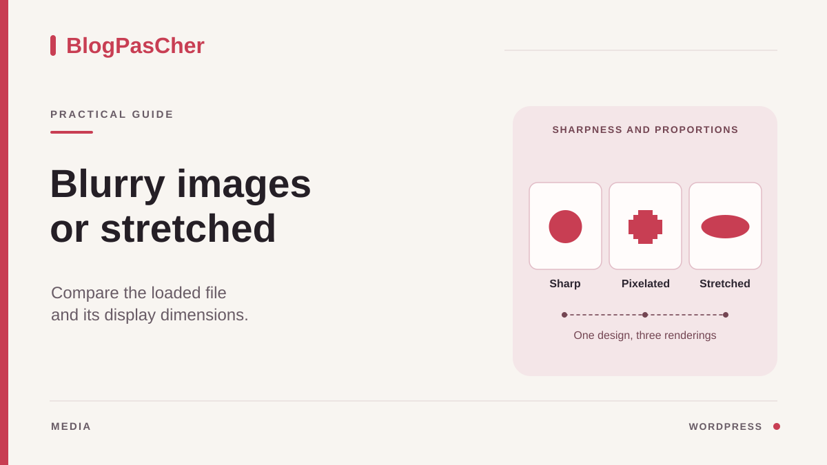
Determine whether the problem involves pixels or shape
Open the public page and find a problem image. Choose a visible detail for comparison, such as lettering on a poster or the edge of an object. If the detail becomes blurry or pixelated while shapes remain accurate, look for a source that is too small or too heavily compressed. If a circle becomes oval or a face looks elongated, examine the width-to-height ratio. If the face retains its shape but part of it is missing, the image is probably cropped.
Keep a screenshot of the page at its usual width, then on a phone. Note whether every image in a gallery is affected, whether only one instance has a problem, or whether all images of a particular type have the same distortion. A photo that looks sharp in a post but blurry in a homepage section may be served at two different sizes. A photo distorted only within a grid suggests examining that grid's layout.
In the editor, open the page or post, then open List View. Check whether you have selected an Image block, a gallery image, a cover, or a featured image. Each component can have its own source and cropping settings. In this guide, start with an ordinary Image block, then apply the same comparisons to the component that actually supplies the image.
Record the media name, its known dimensions, and the block's width, height, and aspect ratio values. If the document is published, use a preview or draft for testing. Keep the original file so you can select it again after a comparison.
Examine the file in the Media Library
Under Media > Library, open the details of the media in use. Note its pixel dimensions and URL. Open the file in a tab when the interface allows it and examine a detail at close to its native size. If the file is already blurry, enlarging the block will not create any detail. Find the original file from before compression or a higher-definition photo.
Watch for copies with similar names. A small version exported for a message may show the same subject as an original photo. A library image may also be a version resized during upload. Compare the dimensions and sharpness of the available file. A version 320 pixels wide may suit a small card, whereas an image occupying 800 pixels on the page will generally need a more detailed source.
If the media displays correctly in the library, open the document's photo in the preview and compare them. The library and the page do not always load the same file. A site may generate several variants on upload or request versions suited to the device. The original media's quality is a starting point; then check the variant used and the width at which it is rendered.
If the image comes from an external URL, identify that address and check the size actually available. A remote service may serve a smaller version even if the image looks large in the editor. If you have the right to reuse the file and a good-quality source, prepare a suitable copy in your library. Keep the old URL so you know exactly what was replaced and why.
Choose a resolution suited to the display width
Select the Image block and open Settings > Block. Look for Resolution or Image Size in the block settings. Available choices may include Thumbnail, Medium, Large, or Full Size. Actual dimensions depend on the site and file. The labels identify a category, while the pixel count determines the amount of detail available.
If a thumbnail is stretched across a large width, try a larger available size without uploading the photo again. Compare the sharpness of your chosen detail in the preview and see whether the improvement remains visible on a phone. A 1024-pixel variant may be enough for a column approximately 600 pixels wide, depending on the screen density and the subject's details. A dense screen may benefit from a larger file at that same width. Visual comparison and transferred file size help you decide.
When an image serves only as a small thumbnail, keep a reasonable variant. Always loading the full-size image may make a gallery heavier without any noticeable improvement. For an image whose details need to be readable, you can offer a way to open an enlarged version if the interface and content suit that approach. Check that this action is understandable and that the caption remains accessible.
If the desired size is unavailable for an older image, first check the file's dimensions. A source that is too small cannot provide a genuinely more detailed variant. If the source is sufficient but an intermediate file is missing, record the case and compare it with a recent image. Request regeneration limited to the affected media if this cause is confirmed. Changing the site's general image sizes for a single instance would broaden the scope of the intervention.
Restore the aspect ratio without losing the subject
In the Image block, examine Styles, then the aspect ratio and dimension settings. Where the block allows it, restore the original aspect ratio and leave the height automatic. Set a width suited to the column. If fixed width and height values were forcing a differently shaped frame, this change should restore objects' natural proportions. Check the entire image for any other cropping that remains active.
For a series of cards, identical frames may be intentional. Choose the behavior according to their purpose. A Cover fit fills the frame and cuts off part of the image if the aspect ratios differ. A Contain fit keeps the whole subject and may leave space around it. A decorative photograph may tolerate cropping. A poster or diagram containing information often needs to remain fully visible.
If a focal point setting is available, place it on the part that must remain visible in a cropped frame, then check both a narrow and a wide window. If the block does not provide a focal point, try an image whose composition suits the frame or a more suitable aspect ratio. For a gallery, check that changes apply at the correct level. Changing the entire gallery may crop every image when only one needs attention.
Avoid manually resizing the file to force it into a different shape. A file that has already been stretched remains distorted even when the block respects its aspect ratio. In that case, return to the original, then choose an actual crop if the composition needs one. Keep the complete source for other uses.
Check the variant actually selected by the browser
When the result does not match the size selected in WordPress, open the public page and inspect the image in the browser tools. Select the image tag, then observe its rendered width and height. In the Network tab, filter for images and reload the page. An image loaded as it approaches the screen may require scrolling to its position. Identify the request corresponding to the detail you are examining.
If the image advertises several variants, the browser may choose one based on the specified width and display characteristics. Do not therefore infer its choice from the src attribute alone. With the image element selected in the inspection tools, the browser tools may show its current source or currentSrc property. Compare that URL with the request and examine the loaded file's dimensions when the browser displays them.
Then test the image at the width where it looks blurry. Reload the page after changing the emulated window size. A browser may reuse a larger variant already loaded, obscuring the comparison. If the developer tools allow it, enable Disable cache and keep the tools open while reloading. You can also use a new private session after closing the other private windows. Observe the served file and rendered width for each test.
When the selected variant is too small, check whether the template, a gallery plugin, or a delivery service changes the available sizes. Give the person responsible the exact URL, rendered width, and served variant. This record helps distinguish a missing file from a rule that tells the browser a different width from the one on the page.
Correct a theme or page builder rule
If the same photo looks correct in the editor but distorted only on the public page, examine the active styles in the browser. Look for imposed width and height values, a fit setting that stretches the frame's contents, or a style applied to every image in a section. Compare the file's shape with its rendered rectangle. A square file in a rectangular frame may be cropped, centered with empty space, or stretched, depending on this rule.
In a block theme, check whether the affected Image block is in a template, a synced pattern, or the page itself. Correct the dimensions there and check another instance if the area is shared. In a classic theme, image options may be under Customize or in the theme's own settings. With a page builder, inspect the image widget or component and its size, height, and fit settings for each screen.
If the controls are insufficient, the person responsible can test a correction in the browser tools before applying it to the theme. Temporarily disabling a fixed height lets you check whether the distortion disappears. A style correction should target the responsible component. Card images, avatars, and logos may need different rules and would be affected by a general change.
If a delivery service reduces or compresses the image, compare the source accessible from the media item with the response actually displayed. Record their sizes and the lost detail. Look for a service setting that targets this context. Keep the previous rule so you can restore it if the improvement in quality brings excessive file sizes on other pages.
Replace only the media that needs it
If the file itself is insufficient, prepare a sharper source and retain its aspect ratio. Choose dimensions compatible with its intended use, then compare its file size and quality with the existing source. For a diagram containing text, examine the smallest characters. Compression that is acceptable for a landscape may erase these details. Keep the working file outside the site for future exports.
In the block, use Replace or the media selector in the panel when available. First check whether the better source already exists in the library. If you need to upload a new file, use an identifiable name and avoid creating several copies of the same export. After replacement, check the alt text, caption, anchor, and any link. How these fields behave may depend on how you replace the media and which editor you use.
If the document opens an enlarged image, test that action with the new source. If the photo belongs to a gallery, also check the order and neighboring captions. A content image is not necessarily the same instance as the document's featured image. Check the list thumbnail separately if it also needs to change.
Keep the old media until you have checked its other uses. Deleting it from the library may create broken links in other pages or messages. To roll back, select the old media again in this block and restore the settings you recorded. A targeted replacement makes this easier and lets you compare the two sources until validation.
Check sharpness, cropping, and file size after the change
Reopen the preview at the width where you noticed the defect. Compare your original chosen detail and the shape of an easily recognizable element. Then check a narrow screen and a wider view. The expected result is an image sharp enough for its use, with consistent proportions and all important parts visible. An enlarged version should retain the necessary detail without forcing the page to transfer that large file for every small thumbnail.
Also check the caption and actions around the image. If you removed a fixed height, the page may rearrange itself. Check that the following text remains correctly positioned and that cards in the same row keep acceptable alignment. If you changed a shared rule, open a page containing an image of the opposite orientation, such as a portrait after a landscape.
After validating and saving, open the public page in a visitor session. If the old variant remains visible, compare the media URL, the received response, and the saved state before changing more settings. Page caching and image caching can occur at different levels. Use a targeted purge if available and confirm the variant afterward.
To undo the change, restore the block's resolution and dimensions, or choose the old file if the source was replaced. For a theme rule, restore the declaration you tested, then check the reference page. Record the dimensions of the file ultimately loaded and of the displayed block so you can repeat the comparison if the image or template changes.
Record the source and display size with a local diagnostic
In the developer tools, select the relevant img tag in the inspector, then run this diagnostic in the console. $0 refers to the currently selected element in Chrome DevTools. The code reads its properties without changing the page or transmitting data.
The current source indicates the browser's choice, not whether loading succeeded. Natural dimensions are density-corrected: they do not always represent the downloaded file's raw dimensions. For those, also examine the resource in Network. A display width of 600 CSS pixels is therefore insufficient to certify that a file has enough detail for every screen.
If only the aspect ratio is at fault, test removing the fixed height in the inspector before changing the block. For a blurry image, compare the selected variant and the source file. Reload after each test width; closing the console is enough to end this diagnostic.
(() => {
  const image = $0;
  if (!(image instanceof HTMLImageElement)) {
    console.info('Selectionnez une balise img dans l’inspecteur.');
    return;
  }
  const cadre = image.getBoundingClientRect();
  console.table({
    sourceChoisie: image.currentSrc,
    chargee: image.complete && image.naturalWidth > 0,
    largeurAfficheeCSS: cadre.width,
    hauteurAfficheeCSS: cadre.height,
    largeurIntrinsequeCSS: image.naturalWidth,
    hauteurIntrinsequeCSS: image.naturalHeight,
    densiteEcran: window.devicePixelRatio,
  });
})();
Sources and references
Use these references to check the features, requirements and limitations described. Reading documentation is not a practical test.