

Fix the delay affecting the correct image
The large homepage image appears late, even though the page has already started loading. Before compressing the entire library, check whether this image is actually the element determining LCP. This metric measures the rendering of the largest eligible content in the viewport. It can be an image, but also a text block; its candidate may change with screen width.
The benchmark for a good LCP is 2.5 seconds or less for at least 75% of visits. A local test alone does not represent these visitors. The aim here is to reduce an identified delay while retaining useful quality, content and layout.
The first fixes use WordPress’s native editor and media features. A priority setting sometimes requires the theme maintainer’s involvement. The modern formats plugin suggested later remains optional. It helps prepare files; it does not fix an image hidden by an animation or an HTML document that arrives too late.
Identify the LCP element in the browser
You need a recent browser and the page’s public URL. In Chrome, the Performance panel can record loading and display LCP information. Choose a page to read, without triggering a payment, submission or sensitive login. Record the selected screen width and network conditions.
The expected result is identification of the relevant element and, if it is an image, its resource. The featured image’s filename is not proof: the theme may use another variant. Then close the tools or restore any changed network conditions to return to your usual browsing.
- Open the page, then F12 and the Performance panel. Start a load recording with the reload button provided by this panel.
- In the report, open the LCP information or event and examine the associated element. Use its highlight on the page to confirm what it represents.
- If the element is an image, record its address and position. In Network, find its request and its start time.
- Repeat with a mobile width. If the candidate becomes a heading or another image, record this change before choosing the fix.
Choose the fix according to the dominant phase
An image’s LCP can be divided into four parts: initial receipt of the document, the wait before the image request starts, downloading the file and the wait before it is rendered. A smaller file mainly helps the download. It does not automatically remove the other delays.
If the document arrives late, start with server response time. If the image request starts late, examine its discovery in HTML, lazy loading and its priority. If it starts early but spends a long time transferring, adjust the file and check its delivery. If it has already downloaded but remains invisible, instead look for a presentation rule or JavaScript processing.
First choose the approach matching your observations. Work on a copy for theme or plugin changes, with file and database backups and outbound actions disabled. For a simple editorial replacement, retain at least the old media, the page version and its settings. On multisite, format and plugin permissions may depend on the network. On managed hosting, check which optimizations are already active before adding any.
Approach 1: choose a suitable resolution in the Image block
This approach is suitable when the LCP image is a native Image block in the page and its resource is unnecessarily large. It requires permission to edit the page. The Resolution menu chooses an available media size; resizing handles and display width do not, by themselves, guarantee a lighter file.
A visual displayed at a modest width does not always need the original file measuring several thousand pixels. However, retain enough detail for the actual width and high-density screens. No single pixel count suits every banner. The browser may also choose a different variant through responsive images.
- In Pages or Posts, open Edit for the relevant content. Select its Image block and record the current media, resolution and display dimensions.
- In the block sidebar, open the settings tab and then Resolution. Try a suitable available size, such as Large instead of Full Size.
- Save on the copy, then check the visual on mobile and desktop, especially detail and cropping.
- Check the file actually received and its transfer in Network. If quality drops too much or nothing changes, restore the initial resolution and examine the source file or the template actually displaying the image.
Replace the file with a prepared copy
If the variants remain too heavy, prepare a new copy of the visual in your usual image tool. Keep the original offline. Crop out what does not need transmitting and export with suitable visual quality. JPEG may suit a photograph; WebP or AVIF can reduce its size when the tool, WordPress and server support them. Simply changing the filename extension converts nothing.
WordPress has natively accepted AVIF since version 6.5 when the server’s image libraries support it. With an administrator, Tools, Site Health, Info, Media Handling lets you examine supported formats. If the selected format is rejected or not processed, keep a compatible format; do not globally disable file checks.
- Export a copy under a new name and compare its size and appearance with the original. Pay particular attention to text, edges and transparency.
- In the editor, select the Image block, then Replace and Upload. Choose this copy without deleting the original media.
- Check alternative text, link, caption and cropping, then save the page.
- Reload the public page and check the new resource. To undo, use Replace, Media Library and select the old media; also restore the settings you retained.
Check the resource actually downloaded
The file size on your computer does not always describe what the visitor receives. WordPress may provide several sizes; a CDN may change the format; the browser chooses according to the markup and its screen. In Network, examine the identified image’s request, address, content type and transferred bytes.
If a response comes from the local cache, its apparent transfer may be almost zero. To compare loads without this cache, use the browser’s network cache disabling option, keeping the same setting before and after. This option does not clear the server cache. Also retain a check during ordinary browsing.
If the block has changed but the old URL is still loaded, check that you edited the correct image. A template banner, featured image or CSS background is not necessarily the content block. Do not delete all media or all caches to force a result. Invalidate only the relevant page using the designated tool if diagnosis shows an old copy, then repeat the measurement.
Approach 2: make the image available from the start
This approach is suitable when downloading starts late despite a reasonably sized file. You need to examine the HTML response and the settings of the theme or optimization already installed. In Network, open the document response and search for the resource name. Compare it with the image markup in the Elements panel.
An important image should be discoverable in the document, with a real source. data-src attributes replaced later by a script can delay this start. Lazy loading, indicated in particular by loading="lazy", is for images that can wait; it is unsuitable for the LCP image already visible in the first viewport. High priority does not override this mechanism.
WordPress already applies loading and priority heuristics. If the HTML is correct, do not add a second identical optimization. If a component rewrites the image for lazy loading, use its documented exclusion for this image only and retain the previous rule. Menus vary: without an identified control, do not randomly disable all site optimization. The result to check is an earlier start without duplicate downloading; restore the previous exclusion if behavior worsens.
PHP fix reserved for an identified image output
This advanced approach concerns an image produced by wp_get_attachment_image(), in a child theme already in place. It requires file access, a backup and a test copy. It does not automatically apply to a saved block, CSS background or image added by JavaScript. First check the code generating the visual.
The example filters a single combination: page 123, media 456 and CSS class hero-principale already present only on this element. Replace these fictional values with those confirmed on the copy. The media can be identified from its editing screen in the library. If you cannot distinguish a unique occurrence, do not use this example.
In wp-content/themes/dossier-enfant/functions.php, add the block inside the existing PHP, without a second opening tag. It retains other attributes, particularly dimensions and responsive sources. It must not prioritize several competing images: also check priorities already added by the theme.
The expected result in the delivered HTML is loading="eager" and fetchpriority="high" on the selected image only, followed by an earlier start if this delay was the cause. Remove only this block or restore the backed-up file if the effect is not as expected. Another component may still rewrite the output; the final check is essential.
add_filter( 'wp_get_attachment_image_attributes', function ( $attr, $attachment ) {
    if ( ! is_page( 123 ) || 456 !== (int) $attachment->ID ) {
        return $attr;
    }

    $classes = preg_split( '/\s+/', trim( $attr['class'] ?? '' ) );
    if ( ! in_array( 'hero-principale', $classes, true ) ) {
        return $attr;
    }

    $attr['loading']       = 'eager';
    $attr['fetchpriority'] = 'high';
    return $attr;
}, 10, 2 );
Handle CSS backgrounds, carousels and hidden images
A background defined only in an external CSS stylesheet may be discovered after that stylesheet loads. The previous filter does not affect it. If the visual conveys information, a template version using a real image in HTML may be more suitable. This change requires revising presentation on a copy with the theme maintainer, rather than stacking preloads.
A preload must match the resource actually used, including its responsive variants. Preloading a large JPEG while the browser displays another file may add an unnecessary download. Do not preload every slide in a carousel: they would compete for the first viewport’s resources.
Finally, if the image downloads early but remains hidden by an animation or loading screen, reducing its size will not remove this rendering delay. On the copy, disable only the identified entrance animation or mask using the component’s documented setting, then compare. Retain its initial state so you can restore it. If you must remove content or a feature to get a better number, the comparison does not yet validate a fix.
Preserve the visual’s space, crop and meaning
A faster image is still a failure if it becomes blurry, cuts off information or shifts text when it arrives. Keep its dimensions and proportions consistent with its place on the page. Width and height attributes help the browser reserve space; they are not instructions to download a smaller file.
In the Image block, aspect ratio, cover and focal point settings change presentation. Check them at both selected widths after replacement. Covering the frame can crop the edges, while displaying the whole image may leave space. Choose according to the content, not just the score.
Also check alternative text in the correct place. The media description provides a default for new insertions; an existing block’s description may be specific to that page. Keep a useful description for an informative image and decorative markup only if it adds no information or function. Finally, remove the old image from the content only after validating the replacement, without deleting its backup file.
Approach 3: prepare new media with Modern Image Formats
For regular uploads, Modern Image Formats can generate WebP or AVIF variants without systematic manual conversion. This free plugin is published by the WordPress Performance Team. Check the offered version’s requirements and your server’s processing capabilities before installation.
It depends on server capabilities and targets newly uploaded images. Activating it does not immediately transform the existing library or fix download priority. If your hosting provider or CDN already performs conversion, compare that service before adding a second pipeline.
- On the copy, open Plugins, Add New. Search for Modern Image Formats, check the author, install and activate.
- Open Settings, Media, Modern Image Formats. Record the initial options and choose an available format according to the indicated capabilities.
- Examine Output fallback images if you need variants in the original format in addition to modern formats. Generating them uses more space; retain this choice in your notes.
- Save the settings and continue with a new test upload, without starting a full library regeneration.
Check a new upload and plan rollback
Use a copy of an image whose original you retain. Upload it to the library, then place it on a test page with the same block and presentation type as the relevant image. Examine its quality, generated sizes and the request actually served. The mere presence of a WebP or AVIF file on disk does not prove the browser uses it.
The expected result is a suitable resource, displayed correctly and less costly to transfer in your case. If the gain is small, quality is poor or upload processing fails, return to the previous media and restore the recorded settings. You can then deactivate the plugin under Installed Plugins.
Deactivation does not reconvert files already created. Do not delete these variants while a page or cache may still reference them. Keep the original and check the test pages before any cleanup. For older media, regeneration is a separate operation requiring preparation with a backup, space and a controlled scope; it is unnecessary for this targeted test.
Compare mobile and desktop under the same conditions
After a fix, measure the same URL again with the same network, cache and window conditions. Keep several values instead of choosing the best run. Also check the LCP element: an improvement can reveal another candidate that then becomes the next limit.
On mobile, check the selected file, cropping and the moment the image starts loading. On desktop, also inspect sharpness at widths actually used. The browser may legitimately receive two different variants in these situations; what matters is their suitability for the display.
Keep before-and-after records for the targeted phase. A reduced transfer with unchanged LCP may indicate that the wait has shifted to rendering. Do not immediately combine several additional settings: return to the loading breakdown to understand the new limit.
Monitor the effect without turning a score into a promise
Field measurements available in PageSpeed Insights can confirm visitors’ experience, but distinguish data for this URL from data for the entire site. Their collection period does not instantly reflect a change. Missing data for a low-traffic page does not prove a fault.
Keep the old media and previous settings until validation. Record the selected size, any lazy loading exclusion and the reason for a forced priority. Recheck after changing the template, carousel or optimization tool, because the LCP candidate may change.
If the delay persists, give the theme maintainer the URL, screen width, identified element, received resource and measured phases. This record enables a targeted template or rendering fix without treating the entire library as though every image served the same role.
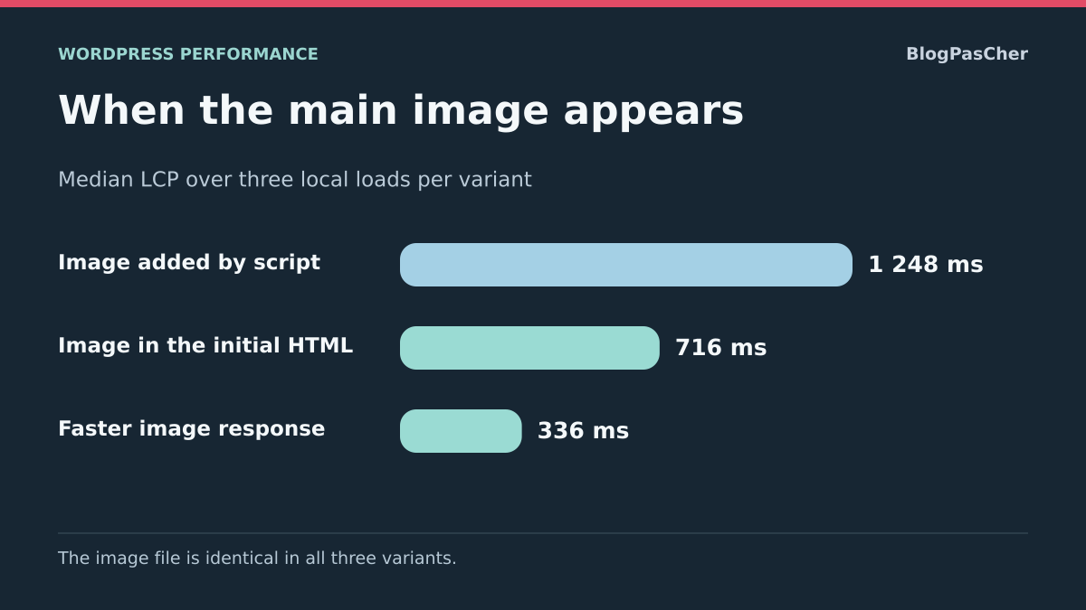
Compare image discovery and request duration
To compare two variants on a copy, retain the same image, dimensions and network conditions. Vary only its discovery: presence in the initial HTML or late insertion by the component. Record the request start, duration and LCP without claiming a gain before measuring.
Another test can target the image service’s response time while retaining the file. It then measures delivery, not compression. Keep several readings and their median; do not combine these changes before understanding their separate effects.
Choose the fix according to the phase taking the time
On your copy, open Performance in Chrome and record a reload without clicking during measurement. Identify the LCP element and open its image request in Network. Record when the beginning of the HTML document arrives, when the image request starts and when that request ends. Also keep the element name and file address.
If the request starts long after the first HTML response, check whether the image appears in that response or whether a script, style or carousel must run first. On the copy, have the main image appear in HTML where the template allows, with suitable dimensions and the same source for comparison. The expected result is an earlier request. If rendering or layout worsens, restore the template and repeat the measurement before trying another change.
If the request already starts early and takes a long time, examine its details before changing priority. A wait before the first byte points toward the service delivering the image. A long download with a large file points toward suitable resolution or compression. If the request ends early and the image appears only later, check the component’s rendering, visibility and display conditions.
Keep a measurement scenario you can repeat
To compare your fix, use the same page, width and network and cache settings over several loads. Check that the LCP candidate remains the one you intended to improve. If the candidate changes, record the new image or text before comparing numbers.
The local measurement indicates where the copy saves time in this scenario. For site monitoring, compare visitor observations separately when field data exists. Their networks, devices and entry pages can change the dominant phase.
Avoid a preload that competes with the correct image
Before adding a preload, check whether the LCP image is already discovered early in HTML and its request starts without a significant delay. In that case, an additional preload does not necessarily address the dominant phase. It may even target a different variant from the one chosen for the screen and add an unnecessary transfer.
In Network, filter by the visual’s name and compare requests after reloading. For each file, record its initiator, format and size. Two variants of the same visual do not automatically prove an incorrect duplicate: check that they actually serve the same occurrence and page state. Also examine preloads generated by the theme, optimization plugin and CDN before adding another.
The free native approach starts by keeping an image visible in the HTML with a suitable resolution, then checking its request. For an advanced template change, retain the old markup and test mobile and desktop. Success requires a useful earlier start, without lost quality or unnecessary downloading. If the gain is unconfirmed, remove only the added preload and return to the LCP breakdown.
Sources and references
Use these references to check the features, requirements and limitations described. Reading documentation is not a practical test.
View 16 references
- LCP: phases to optimize ↗
- Chrome: LCP breakdown ↗
- Chrome: LCP image discovery and priority ↗
- Chrome: Performance panel ↗
- Chrome: network requests and resources ↗
- WordPress: current Image block ↗
- WordPress: attachment image and responsive sizes ↗
- WordPress: loading optimization attributes ↗
- WordPress: targeted image attribute filter ↗
- WordPress: native AVIF support depending on the server ↗
- HTML: image element and dimensions ↗
- Modern Image Formats: publisher, features and limits ↗
- Modern Image Formats: official project documentation ↗
- WordPress: managing plugins ↗
- WordPress: child theme and function location ↗
- W3C — Largest Contentful Paint ↗