Define behavior the edit must preserve
A generated suggestion rounds the corners of the “Afficher l’aide” button in a WordPress post. You like the shape. The button still responds to a click and the panel appears. Yet navigating with Tab takes you from “Préparer le matériel” to “Lire les étapes” without reaching the button. In the example, the suggestion added tabindex="-1" alongside the style. The staging browser still accepts clicks while tabbing skips the control.
The request was an appearance change. The button needed to remain reachable and activatable without a mouse. Write that result before evaluating the proposal. The check covers three distinct moments: focus reaches the button, Enter or Space opens help, and after closing, navigation resumes correctly. If focus cannot reach the control, an activation test starting with a click does not cover the same route. Clicking may focus an element Tab no longer encounters.
Staging help is a small HTML panel displayed above the page, containing one dummy sentence about supplied equipment. The component uses native browser attributes. It is neither a navigation menu nor a modal requiring completion before returning to the page. The panel provides a visible result of button activation. The fault examined occurs at button access, before help opens.
A style proposal may combine several kinds of changes. Examine CSS declarations and HTML attributes separately. A border, radius or spacing concerns appearance. A property such as tabindex affects keyboard navigation. Retain this distinction in the review record. You can approve appearance while rejecting changed functionality even when both occur on one line.
Prepare a button and two markers on a copy
In a working instance, create a dummy workshop post. Add a Custom HTML block with a reference link before the button, the help button and a reference link after it. The markers can link to two paragraphs in the same post. They reveal whether reading order skips the middle of the group. Staging uses “Préparer le matériel” before and “Lire les étapes” after. The button label and displayed sentence remain identical across all states.
Keep a healthy revision or block copy before testing the proposal. Record expected button text, panel ID and both markers. For comparison, save the test on the same working page and copy each markup state. You need to distinguish the raw proposal from the corrected version. If both overwrite one file at each test, the difference to explain may disappear.
Initially, the button is an HTML button with a type and panel target. It enters the browser's normal tab order without an added attribute. The panel is closed on load. Reload the preview as a visitor, then check the first route before editing. Record elements actually reached. If the button is already absent, document that difficulty and find its cause before attributing the fault to the suggestion.
The two markers frame the test, but the page may have earlier links, such as in its header. Do not set a universal number of presses from page start. Tab to the first marker, then count the route between them. This makes testing repeatable in another theme. For a control in a form, tab group or arrow-key list, check that component's intended behavior. This control concerns a standalone button.
Reproduce the difference without manually placing focus
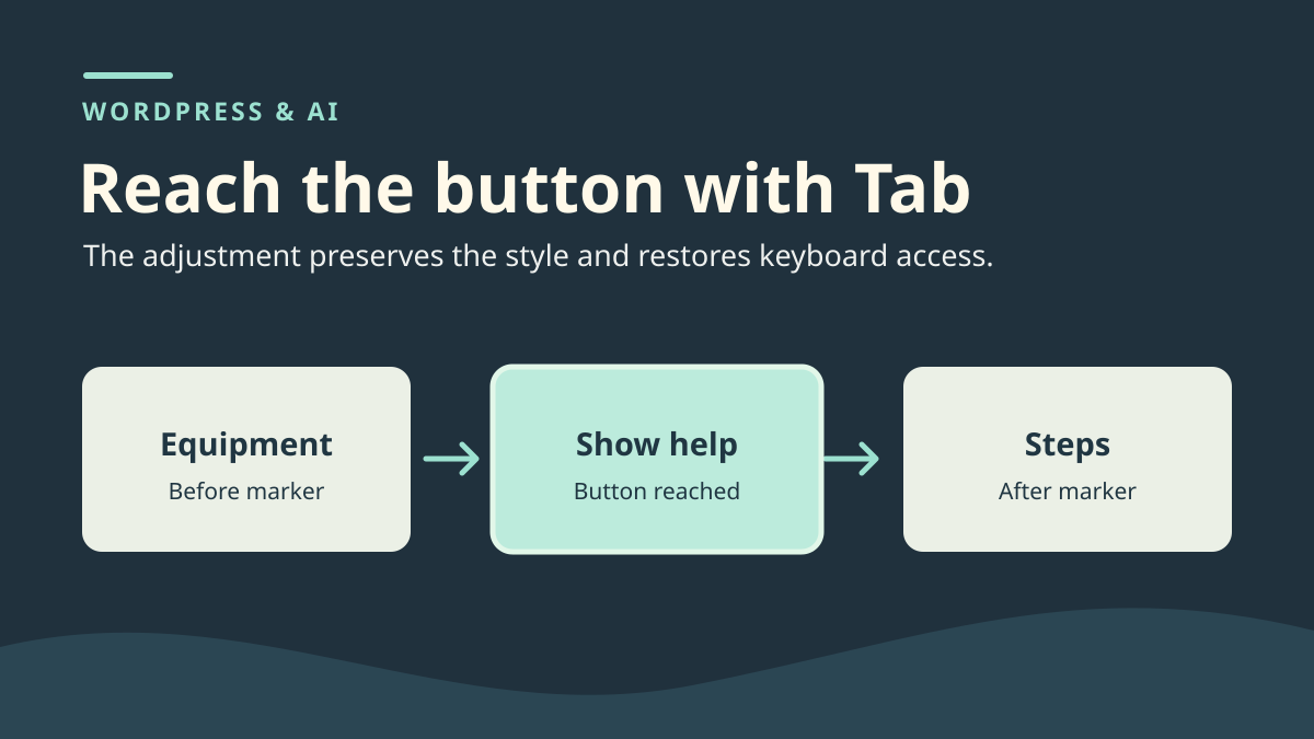
Open baseline rendering in a new tab. Without using the mouse in the document, Tab to “Préparer le matériel”. Press Tab again. The button should receive focus. The next press reaches “Lire les étapes”. Start from that final marker and move backward with Shift+Tab. The button should be reached in this direction too. Check that the focus indicator tells you where you are. If uncertain, inspecting the active element distinguishes poorly visible focus from a skipped control.
Repeat the route on the copy containing the proposal. From the first marker, the next press goes directly to “Lire les étapes”. Backward, it returns to the first marker without passing through the button. The panel is still closed. Then run a separate mouse test. Clicking “Afficher l’aide” opens the panel. You have isolated a difference between tab access and the button action once used.
Avoid a test command that directly focuses the button and then sends Enter. It verifies activation from already-established focus. In this example, it may hide the skip between markers. The same applies to clicking before pressing a key. To test access, start fresh and retain the actual sequence of reached elements. Record the active element after each real Tab press; no downloadable automated checker is supplied here.
If focus reaches the button but you cannot see it, prioritize restoring its indicator. If the button receives focus but keys open nothing, instead examine activation and target. These symptoms may coexist. Establish which is present on the copy before correcting. In the control, only sequential access is broken and the button still works with a pointer.
Connect the skip to the added attribute
Compare the reference button with the one WordPress serves visitors. In developer tools, inspect the element whose text is “Afficher l’aide”. Record its type, target and any tabindex attribute. In the faulty state, the button carries tabindex="-1". Its target remains the panel with ID a03-info. Both neighboring links remain in place. The style change is on the same tag, but border radius and spacing do not explain the skip.
A negative value indicates that the browser may exclude the element from sequential navigation. It can be useful for a component explicitly moving focus or providing its own internal navigation. Here, it is a standalone button expected in the Tab sequence. No other control gives access to help on the copy. Restoring native button behavior therefore suffices. If examining a component managing arrow keys or focus itself, identify its behavior before removing a negative value.
Check where the attribute is produced. If the saved HTML block contains it and the browser receives it, you can isolate the discrepancy in the block. If the raw proposal contains it but rendered output does not, retain that difference in your record. A filter may have removed some code. If it appears only in the browser, examine the template or script adding it. The post block is then only a starting point for locating the source.
The following fragment shows the corrected button and target. In a real post, keep identifiers already associated with the component. If the block is duplicated on the page, check that each panel ID stays unique. A target problem would produce another symptom: the button might be keyboard-reachable but fail to open expected help.
<button type="button" popovertarget="a03-info"
        style="border-radius:8px;padding:8px 12px">Afficher l’aide</button>
<div id="a03-info" popover="auto">
  <p>Le matériel de démonstration est fourni.</p>
</div>
Keep the visual edit and restore tabbing
Start from baseline and transfer only approved style declarations. If already working on a copy with the saved suggestion, remove the added button attribute while retaining its target, text and expected styles. Save the copy, then reopen the block. Also check visitor rendering. The browser should receive a native button without a negative value. No numbered order is needed to force its position. The button regains its place between the document's two markers.
Open the corrected page fresh. Repeat the sequence in both directions and record button focus. After reaching the button through Tab, press Enter. Check the displayed text. Close the panel with Escape and observe focus location. Repeat with Space. After closing, Tab should again reach “Lire les étapes”. These results describe the small staging panel. For another component, define the post-close route according to actions the reader still needs to perform.
Check the visual edit separately: the fragment's eight-pixel radius should remain after removing tabindex. Verify computed style, keyboard navigation and focus visibility with the usual stylesheets. Testing without scripts or styles may isolate native behavior but does not validate your complete site's appearance and interactions.
If the button exists in a shared template, check change scope before saving. A template correction may affect several pages. On your copy, check another page using the same component and one using an independent button. If you cannot isolate the addition, keep the healthy button and postpone the visual edit. The review record must identify where the suggestion applied.
Restore the healthy block and repeat the checks
To undo the test, restore the revision containing the reference button or reinsert the saved fragment. A full restore may erase other document changes. Compare the revision with the current draft if several people worked on the page. When the fault concerns one tag, restoring the old tag suffices if the rest of the component is unchanged. If the button comes from a template or synced block, restore the setting at that source and check its occurrences.
On the restored page, repeat forward and backward navigation, activate help by keyboard, close it and advance to the final marker. Compare the post body and HTML fragment with baseline. The added radius should disappear when restoring the original block, while keyboard navigation should remain functional. These are expected results to verify on your copy, not an execution report provided here.
Retain the proposal and fix record even after restoration. Note the responsible attribute, test page and reached elements. For a reviewer, “the button works” may mean only clicking works. The element sequence and keys used make the evidence precise enough to repeat.
Hand over evidence the team can reproduce
In the checklist, identify the button's exact location. Record the page name, block or template and both markers surrounding the control. Write down order before and after editing. Add the click result separately from the keyboard result. Whoever takes over can observe the regression without knowing the suggestion tool. They will also know which visual change was actually requested.
Before reusing the edit on other buttons, choose one occurrence with the same function and another with a different role. An action inside tabs does not necessarily follow the same focus rule as standalone help. In each case, check what must remain reachable from the page. Then ask the reviewer to repeat the sequence without starting from a click. They must reach the button, open expected content and resume navigation after closing.
Record browser differences if relevant to the site you maintain. A native panel may depend on browser support and configuration. If the audience must access essential information even when the panel cannot open, place that information somewhere accessible on the page. That choice concerns content presentation. Edit verification remains focused on the measured change between the copy's four states.
Read the active element without moving focus
When the indicator is hard to see, a temporary record can supplement manual navigation. Open the browser console on the copy and install this observer. It does not place focus: it observes reached elements.
Return to the page and restart from the previous marker with Tab and Shift+Tab. Opening the console may itself move focus: do not treat that transition as the test result. The log distinguishes a skipped button from a reached button whose styling hides the indicator. It does not prove the panel opens correctly: test Enter, Space and Escape separately.
Remove the observer with document.removeEventListener('focusin', window.bpcObserveFocus), or reload the page. No accessibility plugin is needed for this diagnosis. Do not replace the fault with tabindex="1": a positive order may move the button ahead of controls that should precede it.
window.bpcObserveFocus = event => console.log({
  balise: event.target.tagName,
  id: event.target.id,
  tabindex: event.target.getAttribute('tabindex')
});
document.addEventListener('focusin', window.bpcObserveFocus);
Sources and references
Use these references to check the features, requirements and limitations described. Reading documentation is not a practical test.