

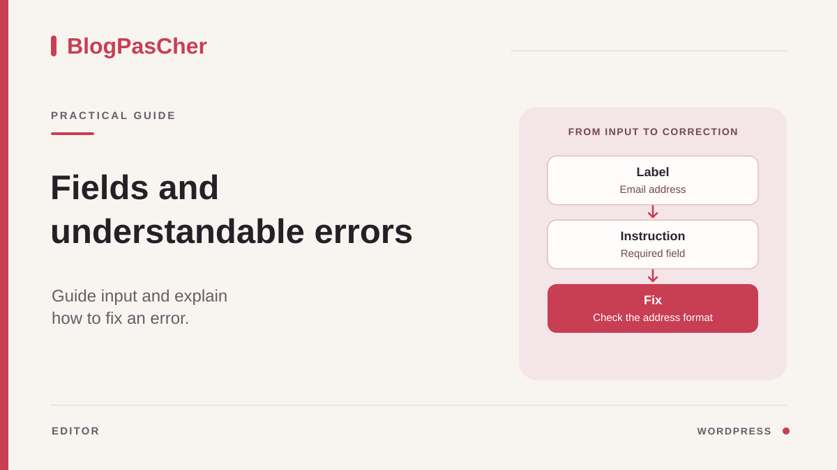
Identify what visitors do not understand
Open the page containing the form and note the expected action. A contact form asks users to send a message, while a booking form may ask for a date and number of places. Find the first point where visitors have to guess what comes next. A field name may be missing, the required format may appear only after an error, or the form may display a general message that does not say which field to correct.
Read through the form before entering anything. For each field, ask what needs to be entered, whether the value is required, and what format will be accepted. Then check what happens to help text when you start typing. An example displayed inside the field may disappear as soon as typing begins. The label and necessary instructions must remain accessible during correction.
Separate a comprehension problem from a technical submission failure. An error asking for a complete email address concerns field validation. A message reporting a sending failure or no response calls for checking submission and its integrations. If both occur, record them separately. You can improve fields without attributing a network outage to their text.
Record the URL, form name, and affected field. Prepare a copy with synthetic data. If you plan submission tests, isolate email, webhooks, and other processing that could leave the site on this copy. Reviewing text and markup can begin before those tests.
Give each field a visible name and useful instruction
Replace vague labels with words describing the expected data. “Contact email address” gives a more precise cue than a field named “Address.” The name remains visible after input. Reserve placeholder text inside the field for an optional example. Someone returning to correct a form must be able to identify a field that is already filled.
State which fields are required. If you use an asterisk, explain its meaning before the fields and check that another cue conveys the requirement. For a special instruction, place the text near the control. A date field can state the expected format if input is textual. A file field should indicate the types and size actually allowed by configuration. Check these rules with the person responsible before writing them.
For a series of checkboxes, name the group and label each choice. “Preferred time slots” might name the group and “Tuesday morning” an option. If only one answer is expected, use the control type intended for that choice. If multiple answers are possible, say so. This information helps users understand the instruction even when choices span several lines.
Keep the words used elsewhere in the flow. If the page refers to an order number, avoid naming the field “Case reference” for that same data. Provide a dummy example when the format is unusual. The example must meet the validation rule and contain no real visitor data.
Check that text identifies the correct control
A label may look aligned with a field without being associated with it in the document. In a plugin-generated form, first check the field's own settings. Use the label supplied by the component when it produces the intended association. If you edit markup, an explicit label associates its for attribute value with the control's ID. These IDs must remain unique on the page.
Compare behavior by clicking the label, then navigating with Tab. For a text field, clicking should normally focus the correct field. For a checkbox, check that it activates the correct option. A screen reader or the browser tools' accessibility tree lets you check the announced name. If the page includes the same form twice, check that the second instance's label targets its own field.
Keep instructions separate from the name. Short help text near the field may be associated by the component as a description. If markup uses aria-describedby, check that the referenced IDs point to existing, relevant elements and that help and error text remain available when both are needed. Avoid replacing a correct association with a name added manually in several places.
On a phone, observe the order of the label, field, and description when the layout stacks. A description stuck beneath another column may seem to identify the following field. Correct the component's layout, then check keyboard navigation again.
Approach 1. Use the existing form's settings
With WPForms, open WPForms > All Forms, then the identified form. In the builder, select a field. In field options, check the label, description, and Required setting. In advanced options, look for the option hiding the label if none is visible on the page. On the copy, show the label again and compare the filled and empty field renderings. A label in the entries table is insufficient to confirm what visitors read.
If you plan to change WPForms default messages, open WPForms > Settings > Validation with the necessary permissions. These settings are shared by the site's forms. Available messages depend on the license and installed modules. Before changing a generic message, check that it remains true for other fields and forms. Preserve variables used by the message where documentation indicates. For instructions specific to a single field, start with its description, then examine the component's capabilities.
With Contact Form 7, open Contact > Contact Forms and identify the form by its title and the page's block or shortcode. The Form tab handles labels and instructions. The Messages tab handles validation feedback and the overall result. Match each change to the correct tab. Check the form displayed on the page after saving on the copy.
If the site uses another builder, look for equivalent field and form options. Record their scope. The same screen may offer local help and messages shared by several forms. Keep a copy of relevant settings before testing.
Approach 2. Adjust the Contact Form 7 form template
In Contact Form 7's Form tab, a label element can contain a tag generating a single control. In the example, label, fieldset, and legend are HTML elements. Contact Form 7 interprets tags in square brackets to generate controls. Paste the fragment into the plugin's Form tab. The email tag with an asterisk makes the field required. The technical name your-email remains available to mail templates or integrations that read it. If the form already uses another name, keep it. Changing a visible label does not justify changing mail-tags.
For multiple checkboxes, keep a shared legend and let the use_label_element option create a label for each choice. Avoid enclosing every checkbox in a single label. The example presents an optional choice of time slots. To require at least one answer among several choices, Contact Form 7 provides checkbox*. To request one required choice, it provides radio. Also adapt the legend and instruction to the selected type. Check that each option's text remains connected to the right checkbox.
Place these fragments only in the affected form on the copy. They illustrate a field and a group to integrate into the markup already maintained. Keep the existing form's submit button and other fields. Open the staging page and check rendered labels and option order. If the theme compresses the form, check readability in a narrow window before changing styles. To roll back, restore the original fragment and confirm that expected technical names are still present.
<label>Adresse e-mail de contact (obligatoire)
  [email* your-email]
</label>

<fieldset>
  <legend>Créneaux souhaités (facultatif)</legend>
  [checkbox your-slots use_label_element "Mardi matin" "Jeudi après-midi"]
</fieldset>
Turn errors into correction steps
A useful message identifies the problem and helps users resume work. For an empty required field, state that it must be completed. For an incorrect format, specify the expected data with a suitable example. A file-size message must reflect this form's limit. Do not use the same numeric limit in a shared message when the site's file fields have different caps.
In Contact Form 7, edit the desired text in the Messages tab. Choose the appropriate response, such as a missing required field or incorrect email format, and use plain text. An overall message can ask users to check highlighted fields. The message near the field should provide the precise correction. With WPForms, respect the shared scope of validation settings and check a second form if you change shared text.
Check that the error remains readable after input and is not indicated only by color. For a long form, a summary at the top can direct users to fields needing correction when the component allows it. Check links and focus if a summary is provided. Someone using a screen reader must be able to find the error at the correct field and hear important overall feedback. For a custom form, ask the maintainer to preserve instructions and associate the error with the control, for example using aria-describedby. If the component uses aria-invalid, check that its state follows validation and resets after correction. For asynchronous feedback, check the announcement mechanism already supplied before adding another.
Preserve correct values during the validation test. Some sensitive fields or files may require re-entry depending on configuration. If necessary, say so clearly. An error should let users resume the form without unnecessarily losing answers already accepted.
Check the form using staging errors
On your authorized copy, save outgoing settings before the first test. In WPForms, open the builder, then Settings > Notifications. Disable notifications the test does not need or replace their recipients, including automatically inserted addresses, with a staging mailbox you control. In Contact Form 7, check recipients and headers in Mail and Mail (2), if the latter is active. Disable secondary sending if you are not testing it. On the copy, disconnect webhooks and other external integrations the test does not need.
Prepare three submissions with dummy data. First leave the required address empty, then enter “essai-sans-arobase.” Each time, check that submission is rejected and the message matches the error. Then correct the address with a dummy value in the correct format and leave the optional group empty. If the form has an active autoresponse for this test, use your staging address. Check that the form accepts submission and displays its confirmation.
For each error, observe the message, its proximity to the field, and the focus destination. An error visible only after mouse movement may be difficult to find using the keyboard. Repeat with Tab and Shift+Tab, then check that no control is inaccessible. If you use a screen reader, listen to the field name, state, and message available after validation. Compare the result with the expected behavior for this component.
Also check the flow at narrow width and with enlarged text. An error line may run beneath a button or beyond a fixed container. Check long fields, checkbox groups, and the first message after submission. If a style change is needed, target the form or its area and compare another form on the site if the style is shared.
Record separately the confirmation displayed, the staging entry if the site stores submissions, and message arrival if you are testing email. To verify delivery, compare the staging mailbox's contents with the valid submission. After testing, delete dummy entries if stored and restore temporary recipients, notifications, and integrations according to the intended copy configuration.
Restore the targeted setting and provide evidence
If a label or instruction was changed in only one form, restore the saved text to return to the initial state. In Contact Form 7, restore the Form fragment or relevant message without reimporting an entire definition. In WPForms, distinguish field options from shared validation text. If you restore a shared setting, check the forms to which it applies.
After a markup change, check that technical field names, expected options, and intended destinations remain in place. Compare the displayed form with the starting copy. If a component translates text, also examine the page language. A message may be corrected in the main version and remain old elsewhere.
Keep a short validation record. State the page, form, field name, initial text, chosen text, and expected behavior. For an error, describe the dummy data that triggers it and the correction that clears it. A redacted screenshot may help if it shows the field and message without personal values.
If an error remains invisible even though its text exists in settings, examine the response and page scripts with the maintainer. Record the check's limitation. New wording does not fix a response never displayed. Keep useful labels and instructions during this investigation, then check the flow once more from the first field to the final message.
Example field after a validation error
Here is a simplified HTML state after rejection of an email address. It serves to compare the DOM produced by your tool; it is neither a complete form nor a tag to paste unchanged into the Contact Form 7 editor.
The label names the field; help text explains its purpose; the error suggests a correction. Both aria-describedby IDs exist in the document and remain unique if several forms are present. A red border alone does not fulfill this role.
After correction and successful revalidation of the field, the component must remove the invalid state and the reference to the now-absent error while preserving useful help text. Do not permanently force aria-invalid="true" in a template. Server validation remains necessary even if the browser checks the format. Compare an empty value, an incorrect address, and a valid value using the keyboard. With a free plugin already installed, prefer its label and message settings: replacing its generated HTML may break its connection to the validation engine. Restore the previous template if these three cases regress.
<label for="contact-email">Adresse e-mail (obligatoire)</label>
<p id="contact-email-aide">Nous utilisons cette adresse pour vous répondre.</p>
<input id="contact-email" name="email" type="email" required
       value="adresse-incomplete" aria-invalid="true"
       aria-describedby="contact-email-aide contact-email-erreur">
<p id="contact-email-erreur">Saisissez une adresse complète, par exemple nom@example.com.</p>
Sources and references
Use these references to check the features, requirements and limitations described. Reading documentation is not a practical test.
View 11 references
- Field labels ↗
- Form instructions ↗
- Error messages and notifications ↗
- Contact Form 7 field labels ↗
- WPForms field options ↗
- WPForms validation messages ↗
- Edit Contact Form 7 messages ↗
- Contact Form 7 checkboxes and radio buttons ↗
- Text and email field tags in Contact Form 7 ↗
- Recipients and Mail and Mail (2) templates in Contact Form 7 ↗
- Notification settings in WPForms ↗