

Stabilize reading and clickable areas
You start reading a post and its text suddenly moves down. An image, advertisement or banner has just taken its place; sometimes the title changes width when its font arrives. CLS, or Cumulative Layout Shift, helps measure this visual instability. Its score has no unit: it is not a load time.
The benchmark for good CLS is 0.1 or less for at least 75% of visits. A local recording helps find a cause without representing every visitor. Some shifts occur after the initial opening, particularly during scrolling or when external content arrives.
The desired result is a page whose content keeps a predictable place, with accessible links and buttons. Hiding the troublesome element to improve a number is not enough. This guide’s three approaches concern image dimensions, reserving a slot and font changes. Choose the one your observations confirm before adding an optimization tool.
Reproduce the shift without installing a plugin
A public URL and Chrome are enough to begin. Record the window width, login state and user flow: opening alone, scrolling, a banner appearing or content expanding. Existing cookies may affect what you see. Compare a regular session and a separate session when that context explains the issue.
In developer tools, the Rendering panel can highlight shifted regions. This display shows where movement is detected; it does not automatically identify its source. The expected result is a dated, visible reproduction of the defect. Afterwards, disable highlighting and restore any changed network options.
- Open F12, then the developer tools menu, More tools and Rendering. You can also search for Rendering in the command menu.
- Enable Layout Shift Regions, then reload the page. Watch the briefly highlighted regions as elements arrive.
- Repeat the scrolling and flow that trigger the jump, without submitting a form or starting a commercial operation.
- In Performance, record that same flow. Open events in the Layout shifts track and examine the animation or reported elements, along with what appears just before them.
Look for what takes up space above the shifted content
The paragraph flagged in a report may be the victim of an addition higher up. Examine the before-and-after screenshots: does an empty area become an image, banner or embed? Does the title’s line count change? Does a fixed height disappear when the script finishes working?
Then choose the appropriate approach. An image whose space was not reserved first calls for dimensions. External content or a late-injected widget needs a stable slot. Text changing shape when a font arrives calls for a typography comparison. If the cause remains uncertain, keep the recording and test one hypothesis on a copy.
Editorial changes require page-editing permissions; Additional CSS or a template may require extra permissions. Before altering a theme or plugin, prepare a backup and a copy with outgoing actions disabled. On multisite, some menus depend on the super administrator. Differences in permissions or hosting do not justify randomly changing a parent file or the entire network’s settings.
Approach 1: give the image a predictable place
This approach applies to a content image whose area appears only when the file arrives. It requires permission to edit the page. In the native Image block, WordPress can supply dimensions from the media item. If the markup already has a correct ratio, also look for a CSS rule overriding it or a container changing size.
First preserve the current page version and original media. Choosing a display ratio can crop the image: check that nothing useful disappears. Merely reducing file size can speed its arrival without fixing the lack of reserved space.
- In Pages or Posts, open Edit and select the identified image using List View.
- Check that it is indeed the Image block and intended media. If it is a custom HTML image or background, move to checking the relevant template.
- In the block styles, examine the ratio, width and height. Restore a ratio consistent with the media and automatic height when there is no reason to force one.
- Save on the copy, then reload without local cache to observe the image arriving. Check reserved space, cropping and sharpness on mobile and desktop. If the result deteriorates, restore the preserved settings and version.
Correct dimensions in custom markup
This advanced variant concerns a template generating an image tag without dimensions. It requires access to an existing child theme’s template and confirmation of the file actually served. Do not edit core or the parent theme directly. An image managed by a builder may need its own setting without editing this markup.
The example shows only the expected form for a fictional 1,200 by 800 pixel resource. In your template, add or correct width and height according to the image’s actual ratio; preserve the source, alternative text, classes, srcset and sizes variants, and other useful attributes. Do not replace the entire tag with this example.
A responsive rule such as a maximum width and automatic height can let the image adapt to its container. However, check that another style does not then impose an incompatible height. The expected result is space that can be calculated before the file arrives. If the template becomes incorrect or the image distorted, restore the saved file. A WordPress image-generation function is preferable to manual assembly when the theme allows it to be used properly.
<img src="/chemin-fictif/image.jpg" width="1200" height="800" alt="Description adaptée au contenu réel">Approach 2: create the container for late content
This approach targets an embed or widget that appears late and pushes text away. It requires editing the page and its CSS. The reserved space must contain this component from the first display. A Spacer block above it does not serve that purpose: the embed may still be added beside it and increase the total height.
On the copy, identify the heights actually required for different screen widths and possible states. A widget whose content varies greatly may require a different integration method rather than an underestimated height. For an advertisement, also retain the dimensions allowed by its service.
- In the editor, insert a Group block at the component’s location. Using List View, place the embed block inside that group without moving the following text into it.
- Select the Group, then its advanced settings. Add reservation-widget under Additional CSS class(es), preserving existing classes.
- Save and check in the public HTML that the container is present before the widget loads and does contain its slot.
- If the script injects content elsewhere, stop this approach and correct its location with the integration maintainer. To undo grouping, return to the preserved page version.
Reserve height with targeted CSS
For a classic theme, open Appearance, Customize, Additional CSS. For a block theme, open Appearance, Editor, Styles, then the three-dot menu in the header and Additional CSS. This latter location corresponds to the current interface, moved since WordPress 6.9. These settings require the necessary permissions.
Preserve the existing CSS, then add only the rule for the group created earlier. The values below are fictional: they assume a component 250 pixels high on a large screen and 180 pixels on a small screen, with a chosen breakpoint of 600 pixels. Replace these values according to your integration. They are neither universal advertising formats nor a recommendation for every widget.
Minimum height reserves space while allowing the container to grow. It therefore does not prevent unexpected overflow and will not stabilize content taller than expected. Do not add overflow:hidden to hide that overflow: you could cut off a button or information.
Save, then observe the slot before and after the component arrives. The expected result is that the following text retains its position in the planned states. Also check the case where nothing appears. To roll back, remove only these rules and restore the field’s contents if necessary.
.reservation-widget {
    min-height: 250px;
}

@media (max-width: 600px) {
    .reservation-widget {
        min-height: 180px;
    }
}
Plan for empty states and banners
Reservation must work when the external service is late, fails to respond or has nothing to show. Abruptly removing the empty container after several seconds can cause another jump. Retaining the space or displaying a stable replacement message may be preferable depending on the page’s use. Choose this behavior in the integration itself and check it on the copy.
A banner inserted at the top can push the whole document. If its tool offers several presentations, compare a reserved slot or a presentation that does not alter content flow. However, an overlay may hide links or hinder keyboard navigation: these effects must be checked, not just CLS.
Keep consent functions and necessary information accessible. Do not remove a banner to obtain a better score or change its trigger logic without understanding its role. Compare states with and without a previously saved choice. The same checks apply to a header changing height during loading, a promotional message and a login bar: every area must behave consistently.
Approach 3: compare a heading’s font
This approach applies when a heading changes width or line count as a downloaded font arrives. It requires editing that block and Additional CSS. A system font already present on the device provides a targeted comparison; it may alter visual identity and varies with the operating system.
On the copy, select the affected Heading block. In its advanced settings, add titre-stable to Additional CSS class(es) without deleting the others. Then add the rule below to the native Additional CSS described earlier. It does not target every heading on the site.
Reload without local cache and observe whether the line change disappears. In the browser’s computed styles, verify that this family actually applies. If a theme rule overrides it, do not randomly add a series of priority rules: have the targeting adjusted on the copy. The expected result is a comparison confirming or ruling out the font change as the cause.
To undo, remove only this rule and this class. If the comparison is conclusive but the original font must remain, have its fallback font’s metrics brought closer or its loading adapted. This adjustment requires actual files and measurements; no universal percentage is suitable.
.wp-block-heading.titre-stable {
    font-family: system-ui, sans-serif;
}
Examine late styles and animations
A page may initially appear without its final presentation, then rearrange when a CSS file or optimization arrives. If the defect appeared after a deferred CSS loading setting, compare only that setting on the copy with its previous value. Use the documented menu of the tool actually installed; identical labels can conceal different functions across products.
Keep a screenshot and the initial value, restore only this setting, then reload under the same conditions. The expected result is that the presentation change disappears if this transformation was responsible. If nothing changes, restore the initial state and continue analysis. Do not disable all security or all plugins to examine a styling effect.
For an animation, moving an element with transforms can avoid some layout calculations, but that does not guarantee a good experience. An animation can still obscure a button or disturb someone sensitive to motion. Do not convert every animation with a global rule. Correct the identified component and continue respecting the reduced-motion preference.
Also test after the first display
Repeat the flow that triggered the defect: wait for the widget, scroll the page and open the intended interface sections. In the Performance panel, record these steps after the initial load. Layout shift region highlighting can supplement this recording.
Deliberately opening an accordion can move content as expected. Some shifts close to a click or keystroke, within a 500 millisecond window, are excluded from CLS calculation. That does not mean every shift following an interaction is ignored. Scrolling is not a discrete input equivalent to a click for this rule.
Therefore check visible behavior beyond the score. A component that responds slowly then pushes text away can remain disruptive. If a copy does not load the same external service as production, record that difference: a page stable because its widget no longer works does not validate the correction. For a form or store, stay within planned test flows, with no real submission or payment.
Compare the right page and context
A load-time test and visitor data may differ because they do not cover the same duration. A page stable for a few seconds may still move during later scrolling. Personalized content, cookies and ad formats also explain differences between visits.
In PageSpeed Insights, distinguish data for this URL from data for the whole origin, meaning the entire relevant site. If URL data is absent, an aggregate result does not prove that this particular page has the same defect. Keep the local report reproducing your symptom.
Content in embedded frames can also complicate measurement. A JavaScript recording from the main document does not necessarily see every internal shift in an external frame. Send the provider a capture of the flow and the affected integration rather than adding measurement code claiming to cover all such cases automatically. What matters is reproducing the actual problem under the conditions visitors encounter.
Validate the result and keep rollback simple
After each correction, compare several openings on mobile and desktop with the same window, network and cache settings. Also repeat the later flow. Record the targeted shift, preserved content and observed differences; do not keep only the best value.
Check that images retain their meaning, content does not overflow horizontally and controls remain visible. Enlarge text and test keyboard navigation, especially for banners or overlays. An estimated height can become insufficient with longer text or another display.
If the result is poor, undo only the tested change: image settings, template markup, CSS rules or block class. Preserved copies allow this rollback without restoring the entire production database. If you changed a dynamic component, then confirm that its operation and empty states have returned to the expected behavior.
Prevent shifts during future changes
Keep a record with the page, screen width, flow and corrected cause. Note why space is reserved and which dimensions it is based on. Check again after changing media, fonts, banners or external integrations: a slot suitable today may become insufficient with a new format.
Browser tools, native blocks and component-scoped CSS are enough for the approaches offered here. A caching or compression plugin is not an automatic layout repair tool; adding several optimizations without a recording can make the cause harder to find.
If the defect persists, provide the site maintainer with the URL, context, recording and before-and-after screenshots. Specify the element moving and the one that seems to take up space. This distinction makes it possible to correct the responsible image, container or style without reorganizing the whole site.
Compare the same load with and without dimensions
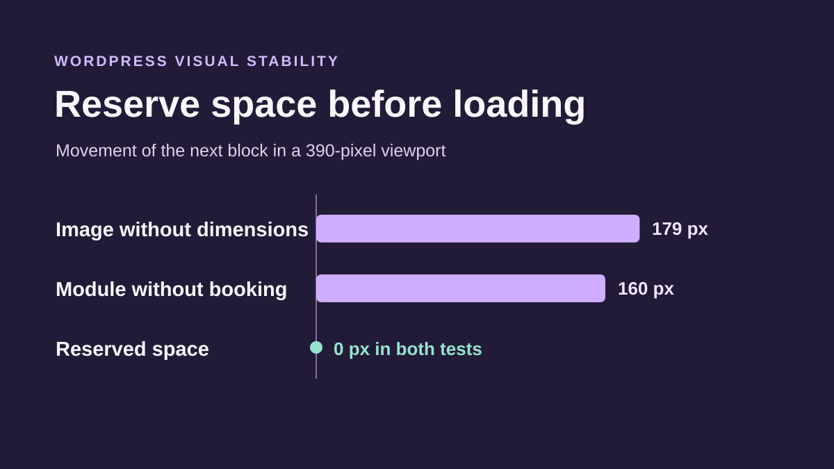
To compare the effect of dimensions, prepare two renderings of the same media on a copy: one without a ratio known in advance and one with correct intrinsic dimensions. Keep the same width and responsive rules. Record the following block’s position before and after the image arrives. No universal pixel shift can be predicted for every template.
On a copy of your page, choose a marker in the visible area just after the image, such as a heading. In Chrome, open developer tools, then Performance. Set the same width and network speed for both attempts. Record a load before the correction and locate when the heading moves in the layout shifts track. In Elements, check the dimensions of the file actually displayed. After correcting the block or template producing the image, record the same page again. Check both that the heading keeps its position and the image retains its proportions.
If the new setting stretches or crops the image undesirably, restore the previous value or revision on the copy. Then check the selected file’s proportions at that width before changing the markup again. A different crop on mobile may require dimensions consistent with the mobile image.
Measure the container’s effect when the block arrives late
For a late module, compare the same content with and without reserved space in its initial container. Measure the following block’s position and observe shift events in Chrome. The height to reserve depends on content and width; a zero score during one test window does not guarantee no shifts throughout the visit.
To test your module, open the template or page copy and identify the element present before the content arrives. In the block editor, place the module in a Group that exists from rendering and assign it the class used by your CSS rule. Choose a height based on the content displayed at your target screen sizes. Replay loading with the same marker after the group. Also check the empty state, load failure and longer content if these cases occur on your site. The group must be able to grow if content exceeds its minimum height. If a large empty space disrupts reading, remove only the added rule and repeat measurements for these states.
Record what each recording covers
To keep a reproducible record, note the copy’s address, window width, action performed, network settings and observation duration. Keep the same visual marker and conditions before and after each change. Compare results by width. A module near the bottom of the screen may move little visible content on desktop while affecting a larger area on a phone.
The shift in pixels locates what moves. CLS also considers the visible area affected and groups events into measurement windows. In a controlled acceptance test, record whether events occur after recent input or during loading. Use these figures to compare two versions of the same scenario. To evaluate actual user flows, examine available field data separately and replay screens or states that load after the first display.
Measure stability without sacrificing content
An arbitrary fixed height can remove a jump in your example while cutting off longer translated text. Test the component with the longest real content expected, then with enlarged text. If height varies with the data, choose appropriate reserved space or a presentation that does not insert content late above the reading area.
For images, keep the correct intrinsic ratio and WordPress responsive variants; invented dimensions can replace a shift with distortion. For fonts, compare several headings, including one that only just fits on two lines: it often reveals a metrics difference.
Chrome and PageSpeed Insights are free observation tools. A caching plugin may change loading order but cannot decide how much space each piece of content should occupy. Therefore validate the responsible component, empty case and later flow, not just the initial-load score.
Sources and references
Use these references to check the features, requirements and limitations described. Reading documentation is not a practical test.
View 16 references
- CLS: definition, interactions and measurement ↗
- CLS: causes and corrections ↗
- Chrome: suggested causes of shifts ↗
- Chrome: displaying shifted regions ↗
- Chrome: recording a load or user flow ↗
- WordPress: Image block and proportions ↗
- WordPress: Group block and targeted class ↗
- WordPress: embedded content ↗
- WordPress: classic Additional CSS ↗
- WordPress: Additional CSS in Styles ↗
- HTML: image dimensions ↗
- CSS: minimum height ↗
- CSS: element aspect ratio ↗
- Fonts: loading and stability ↗
- WordPress: images and dimension attributes ↗
- Chrome — Performance tool reference ↗