

Check whether the whole page really overflows
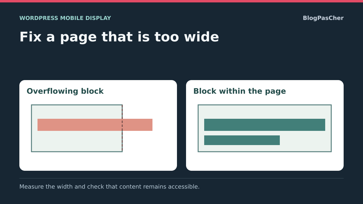
On a phone, the page moves sideways, an empty margin appears or part of the content extends beyond the right edge. A block may impose a width greater than the available space: an image, row, table, unbreakable text or external embed. The goal is readable content within the page width, without cutting off useful elements.
Distinguish document overflow from intentional local scrolling. A large table may have its own scrolling area; moving that table should not require moving the heading and all the paragraphs as well. Similarly, a navigation panel designed to slide in from the side should not be treated as a content block to delete.
Start after reloading, with the page in its normal state. Pinch zooming may allow sideways movement caused by the zoom; this alone does not prove that the layout is wrong. Also check whether the problem appears only after opening a menu or window.
Note the URL, phone, orientation and the point at which the problem starts. Keep a screenshot and the suspect block’s settings. Make your initial observations in the browser; prepare saved changes on a copy if the structure or styles are shared.
Reproduce the problem at a specific width
On a computer, open the public page and gradually reduce its width. Device mode in developer tools also lets you choose a viewport width to observe the transition. It provides a useful simulation, but does not replace the phone on which the problem occurs.
Keep the same session and content state for comparisons. A logged-in user may see an admin bar, button or message that visitors do not see. A banner loaded later can also introduce overflow after a few seconds. Note whether the problem exists as soon as the page arrives or after an interaction.
Compare a working page on the same site with a faulty page. If every destination overflows, first look for a shared part such as the header or footer. If only one page is affected, a block in its content or a particular template provides a more specific lead.
- Record one width at which the page fits and another at which it overflows.
- Compare portrait and landscape on the phone.
- Wait for loading to finish, then test the usual interactions.
- Close panels that should be closed initially.
- Keep these conditions to check each correction separately and identify a regression at another width.
Find the suspect block with visual tools
Right-click near the overflowing area and choose Inspect in the browser. As you move through the page elements, observe their outlines and dimensions. Look for the first container whose width no longer follows its parent’s width, rather than changing every block outside the screen.
In Styles and Computed, examine width, min-width, margins, padding and transforms. An excessive minimum width can prevent a block from shrinking even if its displayed width appears relative. A negative margin or transform can also shift an element whose content is not particularly wide.
Temporarily uncheck a suspect declaration to test its effect. Reloading cancels the experiment and leaves the saved site intact. If the overflow disappears, note the rule, its file and the affected block. The widest element may simply be a descendant of the container actually responsible; work back up the structure to understand the constraint.
In WordPress, then open the page or template and use List View to select that block. Record its settings before changing them. This approach without a terminal is often enough to identify an image set too wide, columns that do not stack or excessive spacing. The optional measurement below helps when the cause remains hard to spot.
Optional read-only measurement in the console
If visual inspection is not enough, open the browser tools’ Console on the public page at the faulty width. Return to the starting horizontal scroll position before measuring. The snippet below reads dimensions and returns possible leads; it changes neither styles, content nor site files.
largeurVisible is the viewport’s inner width measured on the document root. largeurDocument measures the content width, including overflow. A difference warrants investigation but must be considered alongside visible behavior. Element rectangles are expressed relative to the viewport.
The pistes list contains elements whose bounding boxes extend beyond its edges, with a small tolerance. It may include a side menu intentionally outside the frame or content within a local scrolling area. These results therefore do not prove that each element should be deleted or resized. Pseudo-elements are not listed separately; they can also contribute to excessive width.
Expand the results to locate the elements in the inspector, then confirm the cause by temporarily testing the relevant rule. Run the measurement again after each correction with the page in the same state. If the site uses a particular text direction or special panels, interpret their positions in that context. The previous visual approach remains available if you prefer to avoid the console.
(() => {
  const racine = document.documentElement;
  const largeur = racine.clientWidth;
  return {
    largeurVisible: largeur,
    largeurDocument: racine.scrollWidth,
    pistes: Array.from(document.querySelectorAll('body *')).filter((element) => {
      const cadre = element.getBoundingClientRect();
      return cadre.width > 0 && (cadre.right > largeur + 1 || cadre.left < -1);
    })
  };
})()
Fix an image’s dimensions in the editor
If an image is responsible, open the page, template or part containing it, then select the Image block. In its sidebar, record the width, height and any aspect ratio. A fixed width suited to a large screen may exceed the space available on a phone.
Set width and height back to automatic when that presentation is suitable, or choose a relative width appropriate to the container if the control permits it. The height must preserve the image’s aspect ratio. Also check alignment: full width depends on the layout and theme support; it is unnecessary for a small image within text.
Keep the image source during this test. Choosing a lower-resolution file does not fix the display constraint and may simply make the image blurry. If the native value is correct but the site still forces a width, identify the overriding CSS rule before adding another restriction.
- Record the initial values and alignment.
- Change just one dimension or how it is calculated.
- Save, then check the public page at several widths.
- Check that the image remains complete and proportional.
- If the test is unsatisfactory, restore the initial values and continue investigating the container.
Stack columns and fix group spacing
If columns remain side by side on a small screen, select the parent Columns block in List View. In its Settings, check Stack on mobile, or its equivalent in the interface language. Enable this behavior when it suits the reading requirements, save and test the public page.
Do not confuse the parent Columns setting with an individual column’s values. A width imposed on a child or in custom CSS can still overflow after stacking. Resume inspecting the element that retains this constraint.
For a group or row, examine padding, margins and block spacing in its dimension settings. Record the values, then reduce the confirmed excessive spacing. Available controls vary by block; a margin setting is not a minimum-width setting. Do not clear spacing throughout the site to fix a single row.
The expected result is a readable layout at a small width, with no button or content pushed outside the page. Also check intermediate widths and desktop. To roll back, restore the recorded values and stacking state. If the container is flexible but a child still refuses to shrink, the following targeted CSS case may be relevant after confirmation.
Allow a flexible child to shrink when the cause is confirmed
This fix is appropriate if the inspector shows that a child in a flexible layout retains a minimum width determined by its content. It does not apply to all columns by default. Check the container first and temporarily try min-width: 0 on the correct child in the browser styles.
If this test resolves the overflow without cutting off content, select that child block in the editor. Under Advanced → Additional CSS class(es), add contenu-reductible, without a dot and without deleting existing classes. The code below targets only this marked block; applying it to the flexible parent does not necessarily address its child’s constraint.
Add the rule to the site’s Additional CSS: Appearance → Customize → Additional CSS for a classic theme, or Appearance → Editor → Styles → three-dot menu → Additional CSS for a block theme. If this field is unavailable with your permissions or environment, keep any possible native correction or have the person responsible for styles apply this rule alone.
The expected result is a child that fits the available space while its content remains readable. A very long word may still overflow inside it: address its wrapping as described in the next section. Check that the rule takes precedence in computed styles; do not force all columns with !important. To undo the change, remove the added rule and class.
.contenu-reductible {
  min-width: 0;
}
Allow an address or an excessively long string to wrap
A visible address, identifier or word without spaces may overflow even though the paragraph fits within the page. If a white-space rule prevents wrapping, fix that original rule first. An excessive minimum width on the container requires a different setting.
For a link, you can often replace the displayed address with a clear label in the editor while keeping its destination. Then check the link on the public site. If the full text must remain visible, a targeted wrapping rule can meet the need without changing its characters or destination address.
Select the affected text block and add texte-repliable to its additional CSS classes. Put the rule below in the same site Additional CSS as the previous example. overflow-wrap: anywhere allows an otherwise unbreakable string to wrap when space runs out; it does not add a hyphen character to the content.
The expected result is text that flows across several lines within its container. Check links, readability and copying the text. Do not apply this rule throughout the site without a need, especially to content whose alignment or structure must remain specific. To roll back, remove the rule and class, or restore the original visible label if you changed it.
.texte-repliable {
  overflow-wrap: anywhere;
}
Preserve tables and embeds that need space
A data table may need a width that ordinary paragraphs do not. The goal is then to keep its movement within its own area while the heading and surrounding text remain within the page. Cutting off columns or shrinking characters until they are unreadable does not preserve information.
In a Table block, examine the fixed-width table cells setting. It distributes columns equally rather than according to their content; it is not a mobile repair button in itself. Record its state and compare readability. Remove an excessive CSS width if it has been confirmed, then check the table container’s behavior.
If a local scrolling area is necessary, it must remain identifiable and usable by touch and keyboard. Check access to the last columns and all controls. Simply making the page scrollbar disappear does not prove that the data remains reachable. A custom container may require a complete adjustment of its navigation and dimensions.
For a fixed iframe whose source is supported natively, copy the original code into a working file. On the copy, add an Embed block with the + button, paste the resource’s public URL and click Embed. Check its preview at a small width and test its controls. Replace the old block only if this approach preserves the expected content and behavior. If the source is rejected or a necessary setting is missing, remove the test block and keep the original; then use the responsive mode actually documented by the provider. Do not distort the whole page to fit an iframe.
Avoid hiding the problem globally
A general overflow-x: hidden or overflow-x: clip rule on the whole page can remove sideways movement without fixing the faulty width. Some text, a button or a panel may then remain out of reach. The absence of a scrollbar therefore does not constitute validation.
If such a rule was added during testing, record it and disable it on the copy to resume diagnosis. Fix the responsible block before deciding whether local overflow restriction is still justified for a specific effect. A decorative area and interactive navigation have different requirements.
Similarly, setting all images, tables and blocks to a maximum width does not address a negative margin, a transform or a constraint on their parent. It may degrade elements that already worked. Choose the rule or control whose change actually removed the overflow.
The expected result is a page that fits the width with its content accessible, rather than simply a page that can no longer scroll. To undo a test, restore the recorded initial value. If hiding overflow was an intentional component setting, check its opening, animation and closing before removing it permanently.
Check all content after the correction
Reload the public page under the diagnostic conditions, then try moving it sideways. Compare several widths, both phone orientations and a desktop width. Also check after images, a banner or an embed have loaded, because a late element may reintroduce excessive width.
If you used the console measurement, compare the two widths and examine any remaining leads in context. A numerical result alone does not demonstrate page readability. Intended local scrolling areas must still allow access to all their content and controls.
Test the keyboard and focus on links and buttons near the corrected block. An element may appear correctly positioned while its outline is clipped or while it moves the page when focused. Check menus, forms and close buttons if the change affected a shared container.
Keep the correction only if it supports these uses and introduces no problems on the reference pages. Otherwise, restore the previous setting or rule and resume identifying the constraint. The tests described here check this specific overflow; they do not replace full validation of every site layout.
Record the source of the fix for future pages
Note the responsible block, the setting or rule changed and the widths used to check the result. Keep the initial value and any classes added. For a shared template part, record which pages were checked after the change.
Future long content can reintroduce the problem: a displayed address, a wider table or a new embed. Checking with representative content is more useful than an empty preview. Keep a few reference pages containing the blocks actually used on the site, then check them after a theme or builder change.
No new plugin is necessary for the native and targeted CSS fixes in this guide. A plugin that hides movement across the whole page does not prove that content remains accessible. If a third-party component creates its own width, identify its setting or source and send the precise case to its maintainer when the fix exceeds your access.
A useful report includes the URL, width, identified block, relevant rule and the effect of the change confirmed on a copy. Specify whether the overflow affects the document or only a data area. This information makes it possible to fix the actual component without rewriting the entire mobile layout.
Validate page width and table scrolling
On a copy, measure the document width in a 320 CSS pixel viewport. Test a flexible row and a long address separately. Apply the corresponding fix from this guide to each, then measure again. The document width must fit within the viewport without hiding content. Also check that the link remains activatable with Enter.
Use test widths suited to your page and text size. A narrow viewport helps expose the problem. Also check reading after zooming and on a phone when these uses are relevant to the site.
- Repeat the measurement before and after at 320 CSS pixels, then on a wide screen. At 1,280 pixels, check that the correction also preserves the wide layout.
- If a table needs more space, reach its area with the keyboard and check the last column. The arrow keys should allow movement through the table within its area without scrolling the whole page horizontally.
- Temporarily remove the rule in the inspector and check that the problem returns. This lets you link the correction to a specific constraint. Save the rule on the test site only after checking nearby content.
Also test content that changes after loading
Repeat the check with a long heading, a full address and a form error message when these elements exist on the page. A template that fits with three words may overflow with the actual published content. Also compare the state before and after opening the menu: an off-screen panel intended for animation does not need the same fix as an excessively wide paragraph.
In a grid or flexible row, check the child whose minimum width depends on its content. The previously suggested min-width: 0 rule must target that child rather than every element in the document. After the test, select and copy the text, then activate the last link or button in the area. If scrolling has disappeared but a control is no longer reachable, the correction is still hiding the problem. Restore only the rule tested and continue with the responsible container.
Sources and references
Use these references to check the features, requirements and limitations described. Reading documentation is not a practical test.
View 15 references
- Device mode and simulation limits ↗
- Inspecting styles ↗
- Width of overflowing content ↗
- Visible document width ↗
- Element dimensions and position ↗
- Native block dimensions ↗
- Columns and stacking on mobile ↗
- Image block dimensions ↗
- Table block settings ↗
- Native Embed block ↗
- Wrapping long strings ↗
- Minimum width of flexible elements ↗
- Overflow and horizontal scrolling ↗
- Content reflow and useful exceptions ↗
- Additional CSS in Styles ↗