

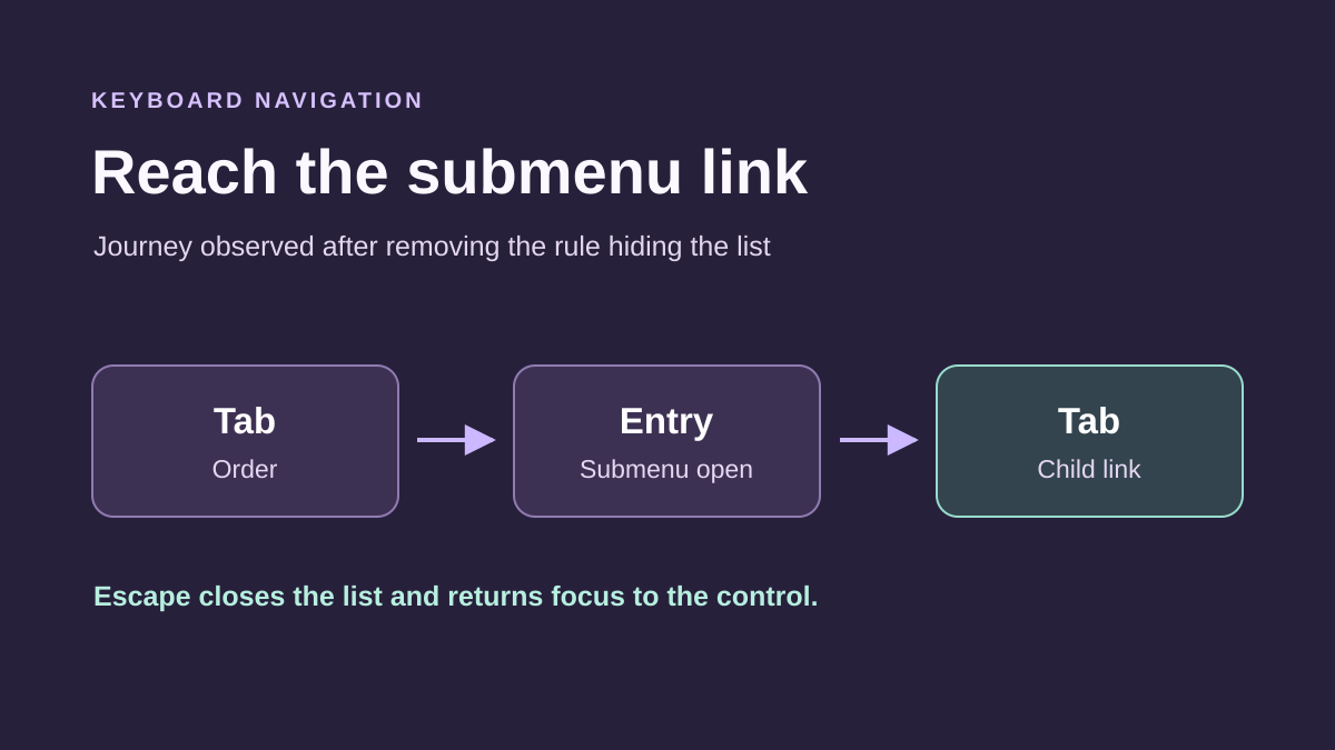
Identify where keyboard navigation fails
The submenu works on mouse hover but stays closed when using Tab. In another case, it opens then disappears before the first link can be reached. It may also remain visible while focus—the element ready to receive keyboard action—is no longer identifiable. These defects require different corrections.
The desired result covers the full sequence: reach the control, open the submenu, traverse its links, follow a destination or close it, then continue through the page. Opening alone is insufficient. A menu requiring a particular typing speed or mouse movement to exit its panel remains problematic.
Start at a precise public address with browser and width recorded. Compare a logged-out visit with the state in which the defect was reported. Keep a settings screenshot before changing the header because its structure and menus may be shared across pages.
This guide concerns link lists in site navigation. It distinguishes native Navigation block settings, custom styles obstructing navigation and possible replacement of an inadequate classic component. A plugin or randomly added ARIA attributes do not constitute an automatic repair.
Test the sequence without helping the menu with the mouse
Reload the page, then move the pointer outside navigation. Use only Tab to move forward and Shift + Tab to return. Record the reached label and visible indicator. Opening the panel beforehand with the mouse can hide the exact defect you are investigating.
A link normally leads to a destination; a button performs an action such as opening a list. On a disclosure button, Enter or Space should trigger the intended activation. In ordinary navigation, links and buttons can be traversed with Tab. Arrow keys may supplement this, but their absence does not automatically indicate a failure.
Observe closing behavior and where focus goes. In a modal panel, focus may remain inside while open; it then needs a keyboard-usable exit. This temporary restriction differs from an inescapable trap.
- Reach an item containing child links.
- Identify any link and its opening button.
- Open by keyboard, then reach the first and last links.
- Move backward and test closing, particularly Escape if the component supports it.
- Check that you can continue outside the component.
- Record the first failing step before changing a setting.
Distinguish site navigation from an application menu
The word menu covers several interaction patterns. Site navigation can remain a list of links with buttons showing or hiding sublists. It need not automatically adopt ARIA menu and menubar roles, which introduce more complex behavioral expectations for assistive technologies.
Do not add these roles to eliminate an analyzer message without understanding the component. Adding a role does not make an element actionable, write closing code or manage focus. Likewise, aria-expanded must reflect the panel’s actual state; fixing it at true does not correctly open the panel.
Prefer controls already provided by the block or a maintained component. If the parent also leads to a page, visitors must be able to reach that destination while opening its children. A separate button may meet this need. A parent converted into a control requires retaining its destination elsewhere in navigation.
You can also make child pages accessible from the section page. This route complements the menu and helps users avoiding dropdown lists. It does not remove the need to fix a keyboard-unusable submenu, but provides another concrete route to the same content.
Configure native Navigation block opening
With a block theme, open Appearance → Editor, then the template or header part actually used. In List View, select the parent Navigation block. Its Settings sidebar offers submenu behavior, including hover or click visibility and arrow display.
Preserve current values, then try click opening if current behavior causes problems. Depending on block mode and version, the parent label may become the submenu control: check its role in public output. Do not assume that same label still leads to its page. If the destination must remain accessible, retain it as a child link through the following approach.
Hover mode with an arrow may provide a separate link and control in native output. The word hover in the setting therefore does not establish that the component necessarily ignores the keyboard; check actual behavior and added styles.
- Record the mode and arrow display.
- Choose the intended behavior and retain necessary destinations.
- Save the changed template or part.
- Repeat keyboard navigation on the public page.
- Check opening, links and closing, then another page using the header.
- If unsuitable, restore initial values and preserved structure.
Keep the section page when a parent becomes a control
Consider an example: Services leads to a general page and contains several child pages. If the chosen mode turns Services into an opening button, the general page needs an explicit entry. Adding a Services Overview link to the sublist preserves that destination without asking the same gesture to navigate and open.
In the menu’s List View, select the relevant submenu. Use its add button to insert the existing page among its links, then position it as desired. Check URL and label. You are adding a navigation link to the existing page, not creating a page or copying its content.
Save, then test the parent and new entry by keyboard. The parent should trigger intended opening; the child link should reach the general page. Also check phone touch and other parents’ behavior. A mode change may affect the entire navigation, not only this example.
To undo, restore the previous mode, then remove only the added link if that matches your initial choice. Do not delete the Services page itself. If the menu is shared across blocks, check their uses before changing its structure: a new entry may appear in each.
Find a CSS override that closes or hides links
If native settings seem correct, inspect the submenu on the public page. Look for rules imposing display, visibility, opacity, fixed height or hidden overflow. Compare hover behavior with what happens when the button or a child link actually receives focus.
A custom rule limited to :hover may show the list for the mouse, then hide it as the pointer leaves. If it overrides intended component behavior, the keyboard may reach an invisible panel or lose its path. A parent rule can cause the defect even when links themselves are configured correctly.
Temporarily uncheck the suspected declaration in Styles, then repeat keyboard navigation. Inspection helps identify its source without changing the site. If temporary removal restores navigation, copy your Additional CSS and remove only the confirmed override in its original editor.
The expected result is retaining the sublist during intended use without making every panel permanently visible. Reloading undoes the browser attempt; restoring preserved CSS undoes the saved correction. If a script controls state, a simple :focus-within rule does not replace management of buttons, closing and accessible states.
Restore a focus indicator on the affected navigation
Navigation may work while nothing shows which link has keyboard focus. First find any custom rule removing outlines, such as outline: none. If removing it restores the theme’s intended indicator, this source correction is preferable to adding a second rule.
For a native Navigation block needing a specific indicator, add navigation-clavier, without a dot, under Advanced → Additional CSS class(es), preserving existing classes. The code below targets only links and buttons descending from this block. Blue is an example for a light background; adapt it after checking actual backgrounds, including the open panel.
Place the complete rule in the site’s Additional CSS: Appearance → Customize → Additional CSS for a classic theme, or Appearance → Editor → Styles → three-dot menu → Additional CSS for a block theme. This is not a snippet for a field expecting only a block type’s properties.
Test with Tab to see the outline around every reached control. Check that a parent does not clip it and a higher-priority rule does not override it. To roll back, remove only the added rule and class. This code makes focus perceptible; it creates neither submenu opening nor closing.
.navigation-clavier a:focus-visible,
.navigation-clavier button:focus-visible {
  outline: 3px solid #174ea6;
  outline-offset: 3px;
}
Correct a classic theme component without rebuilding links
In a classic theme, Appearance → Menus manages destinations and locations but does not by itself create the theme’s keyboard behavior. If submenus lack any usable control, examine the navigation panel documented by that theme and customizations added to its header.
Look for click-opening mode or an accessible-navigation option actually provided by the component. Preserve values, apply the option on a copy and repeat the complete sequence. If a theme update corrects this behavior, back up customizations before trying it on that copy; keep the previous package for controlled rollback.
A link whose address is only # does not magically become an accessible button. Likewise, assigning a positive tab order to every element does not repair logic and may create navigation inconsistent with the rest of the page. Correct the component instead of accumulating these workarounds.
If the theme offers no satisfactory solution, simplify navigation or replace its component at a compatible location. Keep existing menus and links. The expected result is reproducible navigation without a mouse; to undo a setting, restore its initial value. Do not announce a correction merely because links remain visible on hover.
Targeted replacement option with Max Mega Menu
Max Mega Menu can be tried at a classic menu location already registered and displayed by the theme. The product, published under author megamenu, documents keyboard navigation. The basic approach here requires no Pro feature. Check the offered version’s requirements before installation and test integration with your theme.
Preserve current assignment and settings, then install the plugin on a copy through Plugins → Add New Plugin, checking its name and author. Enable integration only for the affected location. The plugin cannot improve a location the header does not display.
In Mega Menu → Menu Locations, open the intended location. Under Desktop, Event offers Click among other settings. Choose that behavior if intended, save and test the resulting button or link. Check parent destinations and child links; touch behavior may have separate settings.
The result must permit natural keyboard navigation with identifiable focus and an exit. Check residual theme styles and any second button. The product’s accessibility statement does not certify your site’s result. To undo the attempt, disable integration for that location or only the newly added plugin and verify return to original navigation.
Ensure understandable closing and exit
After opening, check how the component closes and where focus returns. In disclosure-button navigation, activating again may close the list; Escape is also a common command to test depending on the component. Visitors must not need to click elsewhere with a mouse to continue.
A modal mobile panel may keep focus inside while open. This can be consistent if closing is accessible and navigation then returns to the page. It becomes problematic when no keyboard-usable control permits exit or the close button is invisible and impossible to locate.
Do not try to fix a trap by removing every focus-management script. You could let the keyboard traverse elements hidden behind the panel. Identify the responsible component and test its setting or correction on a copy, treating opening and closing as one system.
The expected result is a predictable sequence: entering navigation, accessing links, closing and resuming the flow. If component replacement worsens this sequence, return to the previous configuration. Keep a clear content route during repair, such as a section page with child links, without presenting that fallback as a submenu repair.
Check small screens, zoom and links actually reached
Repeat navigation at phone and intermediate widths. The component may change appearance, layout or control. A submenu usable on desktop does not guarantee the same result in a mobile panel. Also test touch, then a keyboard if the mobile context permits it.
Increase browser zoom and check that focus remains visible and links are not clipped. A fixed header may cover a reached element; a panel that is too short may hide its last links. Compare the visible area with the element actually ready for activation instead of concluding Tab stopped working.
Follow a destination and return to the previous page. Then check another submenu and another page using the shared header. If the site has multiple levels, test those actually needed. A correct first level may hide a deeper problem.
These functional checks alone do not constitute a complete accessibility audit. They verify the described flow and identify the most direct regressions. Record browsers, widths and steps performed without inventing compatibility with every assistive technology. Broader validation requires appropriate tests on the real site.
Keep the correction and a reusable test scenario
Before considering the guide applied, reload the site in normal configuration as a logged-out visitor. Check that old CSS or a cached page does not obscure the result. Refresh only affected caches with the existing tool after confirming the correct object was saved.
Keep starting settings, removed rules and any added class. Record the relevant template, header part and menu. If a plugin was introduced, retain its integration location and reason for choosing it. You can then undo a targeted change without deleting menus or pages.
Prepare a short scenario for future updates: reach the parent with Tab, open, traverse children, follow a link, close and exit navigation. Repeat after changing the theme, builder or JavaScript processing. A visual mouse check does not replace this sequence.
If the defect persists, provide the public page, component and first failing step, with settings and comparisons already performed. Specify whether focus is missing, the panel closes or a link cannot be found. This description helps correct actual behavior rather than add accessible markup with no functional effect.
Compare announced state with link visibility
A button may announce aria-expanded=true while a CSS override keeps its sublist invisible. The following approach checks that discrepancy on your copy without blaming a hover rule before observing it.
On your copy, first reproduce navigation without the pointer over the menu. Record button state after Enter and check whether the sublist appears. In the inspector, select the sublist and look at computed visibility, then the rule imposing it. Compare this with a mouse click. If a theme or Additional CSS rule changes the result according to hover, temporarily disable it in the inspector and repeat keyboard navigation before saving a change.
Check forward and backward focus movement
After temporarily removing the suspected rule, check opening with Enter, reaching the first child with Tab and returning to the control with Shift + Tab. Also test closing and link activation: observe these steps rather than infer them from visibility alone.
On the site copy, repeat this flow for a section with a known destination. Check the focus indicator at every step. Verify the link label and opened page title. Start again from the next section and check that main navigation remains usable after closing the panel. If the correction affects other submenus, restore the saved CSS and refine the targeted rule or component.
Record the first failing step
Record the control name, first problematic key, panel visibility, element receiving focus and mouse-click result. If Tab reaches the control but Enter leaves it closed, first inspect the control type and script intended to handle opening. If state becomes open but links remain hidden, examine panel and parent styles. If a link is visible but Tab skips it, also check that it has a destination and the component does not remove it from navigation order.
This protocol covers focus, opening, closing and link destinations. For a site using another component or assistive technologies, repeat the same steps with the relevant tools. Keep before-and-after records so the next check reproduces the entire flow.
Also test submenu exit after changing width
A keyboard check may succeed at a large width and fail as soon as the same header becomes a mobile panel. For a clean comparison, reload at each width, move the pointer outside the menu and start at the page beginning with Tab. Record the mobile panel control and submenu control separately: they open different levels.
In disclosure navigation, check that closed child links are absent from the tab sequence. After opening, they must become accessible; after closing, Tab must let you continue to a visible destination. If focus disappears after Escape, identify the element receiving it before adding an outline: an outline cannot correct focus sent to a hidden area.
The browser and native Navigation block allow this first check for free. For a custom component, use the W3C example as a behavior description for comparison, not ready-made code to replace your menu. Retest any focus-management change with the intended assistive technologies. Keep the previous structure to roll back only the modified component if closing or link access regresses.
Sources and references
Use these references to check the features, requirements and limitations described. Reading documentation is not a practical test.
View 16 references
- Accessible dropdown navigation ↗
- Disclosure-button navigation example ↗
- Keyboard-usable functionality ↗
- No keyboard trap ↗
- Visible focus ↗
- Navigation block and submenu visibility ↗
- Navigation block display and behavior ↗
- Native submenu rendering in WordPress 7.1.4 ↗
- focus-visible pseudo-class ↗
- Computed styles in Chrome ↗
- Additional CSS and styles ↗
- Max Mega Menu: product status ↗
- Installation and menu location ↗
- Max Mega Menu per-location behavior ↗
- Product navigation pattern and ARIA attributes ↗
- W3C — Keyboard focus order ↗