

Define what is missing on the phone
The menu is visible on a computer, but no identifiable links or button appear on a phone. This differs from a present button that does not respond: in that case, the trigger exists and its opening behavior needs examination. Here, the first goal is to find the component that should be visible at a narrow width.
A mobile menu may appear as an icon with several lines or a button labeled Menu. The usual icon's absence therefore does not prove navigation is missing. Also look for a subtle label, a button in another header group or an element blending into its background.
Record an affected public address, approximate width and phone orientation. Check whether all pages are affected, whether the problem starts after scrolling and whether a logged-out visit reproduces it. An intentionally headerless page is not the same case as navigation disappearing across the site.
Keep a screenshot and current settings before changing the header. Pages may share its structure and menu. First seek a native correction, then a confirmed presentation rule. A plugin becomes relevant only if the existing system does not provide the required mobile behavior.
Record the same header at both widths
Start with a page where navigation is expected and open its public address anonymously. Choose one width where the menu works and another where it disappears. In browser responsive mode, record width in CSS pixels and keep the same zoom. If the first window shows the homepage and the second a post, templates may differ. First take both readings on the same URL, then compare templates if only some pages are affected. Next, reduce width in steps to locate the breakpoint. It depends on the theme and its rules. Responsive mode isolates this threshold before confirmation on a real phone.
At each width, record three things. Note visible links before any action, whether a header button exists and what it produces after activation. On a computer, links may be visible without a button. On mobile, a closed panel may hide links until opened. A missing icon is a problem only if expected links are also inaccessible or the site should present collapsed navigation. If the button is visible but unresponsive, keep that finding. The issue then concerns panel opening.
Use the inspector to distinguish a button not rendered from one present but hidden. Open Elements and select the header appearing on the page. Search for the button within that area. Some themes contain two headers or navigations, only one intended for the tested width. Check the element inside the relevant header. Searching merely for ‘Menu’ throughout the page may select the footer menu or an administration-interface element.
Identify the block or location producing the menu
With a block theme, open Appearance → Editor, then the template used by the page. In List View, locate the header part and Navigation block. Select the parent block rather than one of its links: their settings apply to different objects.
Record the chosen menu and any groups surrounding navigation. If the theme uses different headers by template or presentation variants, identify the failing page's header. Editing another header could change the site without fixing the fault. A shared part may also apply the correction to several pages.
With a classic theme, look under Appearance → Menus and its locations. A location is the area the theme provides for displaying a menu. The site may use the same location at every width or a second one for mobile. Its name depends on the theme; do not assume a location named Mobile exists everywhere.
These checks require an account authorized to manage appearance. On WordPress.com or multisite, options and plugin installation may be limited. Appearance → Menus being absent with a block theme is normal: continue with the Navigation block instead of artificially restoring the old screen.
Confirm whether the block setting produces the button
This test concerns a block theme. Open Appearance → Editor with site-management permissions. In the template or template part supplying the page header, select Navigation from List View. Compare the menu name and overlay configuration. In WordPress 7.1, overlay visibility is set under Overlay. Interface labels may vary by language and version. Always uses the button at every width. If the icon exists but is hard to recognize, test the ‘Menu’ label when offered and check its contrast.
On a copy, if links exist at both widths but the button is missing, change overlay visibility from Off to Mobile. Save only the modified element in the summary. Reload the public page at the narrow width. The button should become visible and show links when activated. At the wide width, navigation should retain visible links without requiring another action. If the header is shared, check a second page using it. Restore the initial value if you prefer permanently displayed links and they remain usable at narrow widths.
If the button is still missing from the page structure while overlay is set to Mobile, first check that the observed block belongs to the correct template. Another page may load another header part. If the button already exists in the correct header at the failing width, look for a condition hiding it instead of changing menu links.
Restore navigation missing from the affected header
If no Navigation block appears in the header actually displayed, first check that the omission is not intentional. A landing page may use a template without navigation. In that case, reassigning a complete template is suitable only if its entire layout is wanted; adding a menu to the correct header is a different operation.
For a header that should contain this navigation, preserve its structure on a copy. In the template or part editor, add a Navigation block at the intended location. In its settings, the three-dot menu near the name lets you choose an existing menu. Select the correct set instead of immediately creating a new list.
Check displayed destinations before saving. Editing links in a shared menu may affect other blocks using it. To recover a missing menu, selecting an existing set often suffices; deleting or rebuilding every link would lose a still-useful source.
After saving, check pages sharing the same header part. The expected result is navigation in the correct place without a competing second menu. To undo the test, remove only the added block or restore the previous reference while retaining the menu itself. Removing its display does not require deleting its data.
Test a classic theme's mobile location
With a classic theme, check Appearance → Menus → Manage Locations for available locations. A location is a place where the theme can display a menu. A menu is the set of links. A theme may register two locations, one for computers and one for phones. Check theme documentation or header options to determine which is called at narrow widths. If only one location is offered, check its mobile display and header rules. A separate location's existence depends on the theme.
If a distinct mobile location exists and its menu is empty, record the location name and current assignment. On the copy, assign an existing menu and check its links before saving. Reload the page at both widths. The mobile button or links should appear in the theme's intended area, while desktop links remain usable. If the correct menu appears on the test page but links change on another, check whether both locations use the same set. To undo, restore only the previous assignment. Saved menu links can remain available to another location.
Distinguish a hidden button from an absent one
In developer tools, select the button at the narrow width and open Computed. A display: none on the button can explain its visual absence. The same result may come from a hidden parent. Walk up the structure and find the declaration applying to the first actually hidden element. Check the width condition and source. The same rule may be intended on computers and wrong on phones. If the element has dimensions but is off-screen, also inspect its container and any clipped overflow.
The following fragment is optional. In the local copy's console, paste the function, then the call. Replace .atelier64-header with a selector for the actually rendered header. The second selector targets the native Navigation block's button. For a classic theme, find its button selector in Elements. Run the call at both widths. The function reads structure and computed styles. Its hidden-element list identifies elements to inspect under Styles. It cannot alone determine whether overflow clips the button or a banner covers it.
Under Styles, temporarily uncheck the confirmed declaration at the failing width. If the button returns and its links open, correct the rule where it originated on the copy. If it comes from custom CSS, record the declaration and context before editing. In a block theme, additional CSS is in the Styles options menu. With a classic theme using the Customizer, check Appearance → Customize → Additional CSS. If a builder or theme generates the declaration, correct the setting producing it. Repeat both widths and check that the button remains hidden where links should stay visible. To undo, restore the precise declaration. Avoid a general rule forcing the panel itself to display everywhere.
function releverMenuMobile(enTete, declencheur) {
    const zone = document.querySelector(enTete);
    const bouton = zone?.querySelector(declencheur);
    const resultat = { largeur: window.innerWidth, enTete: Boolean(zone), bouton: Boolean(bouton) };
    if (!bouton) return resultat;

    const rectangle = bouton.getBoundingClientRect();
    const masquages = [];
    for (let element = bouton; element; element = element.parentElement) {
        const style = getComputedStyle(element);
        if (style.display === 'none' || style.visibility !== 'visible' || Number(style.opacity) === 0) {
            masquages.push({
                element: element.tagName,
                classe: element.getAttribute('class'),
                display: style.display,
                visibility: style.visibility,
                opacity: style.opacity,
            });
        }
    }

    return {
        ...resultat,
        taille: [Math.round(rectangle.width), Math.round(rectangle.height)],
        horsFenetreHorizontale: rectangle.right <= 0 || rectangle.left >= window.innerWidth,
        masquages,
    };
}

releverMenuMobile('.atelier64-header', '.wp-block-navigation__responsive-container-open');
Give the button room in the header
A button may exist without being accessible on screen. An oversized logo, excessive spacing or a container clipping its children may push it outside the visible area. Compare the navigation frame in the inspector with actual available space instead of immediately increasing stacking priority.
In the editor, select the group or row containing the logo and Navigation. Examine available layout, justification, wrapping and spacing settings. Record initial values, then reduce unnecessary space or logo width. Check several widths, since a value suitable for a phone may degrade an intermediate width.
If inspection reveals fixed height and hidden overflow in custom CSS, correct the original rule after temporarily confirming its effect. Removing every overflow limit across the site could expose other intentionally hidden elements.
The expected result is a fully visible button with enough room for activation without covering other header functions. To undo, restore only changed values. If a banner covers navigation, correct its own layout; stacking enormous z-index values does not guarantee correct overlap in every context.
Option for a classic location: Max Mega Menu
Max Mega Menu can provide mobile navigation at a compatible classic location if theme settings do not meet the need. The product is published by megamenu in the official directory. Before installation, compare the offered version's requirements with WordPress and PHP on your copy; declared numbers may change. Basic mobile display is available in the free version.
This procedure assumes a location already registered and displayed by the theme. The plugin will not repair a header displaying no menu area. Keep current assignments and test on a copy before replacing the site's navigation behavior.
Keep this option if it meets the need without duplicates and remains keyboard-usable. It does not justify replacing a native Navigation block that works correctly.
- Under Plugins → Add New Plugin, search for Max Mega Menu and check the author.
- Install and activate the plugin.
- Under Appearance → Menus, choose the menu assigned to the intended location.
- In the Max Mega Menu Locations box on the left, enable integration for only that location and save.
- Reduce public-page width to check the trigger and links.
- If the theme's old button remains, follow the documented integration for that theme; do not globally hide all buttons.
- To undo the test, disable this integration or only the newly added plugin, then check that the theme menu returns.
Avoid a gap between the two display breakpoints
If the theme hides its desktop menu at a different width from where the mobile component appears, a range may provide no navigation. Revisit diagnostic widths and check both transitions. Testing only a large screen and narrow phone may miss this intermediate defect.
In Max Mega Menu, Responsive Breakpoint is under Mega Menu → Menu Themes → Mobile Menu. Choose the menu theme actually used by the location, record the current threshold and align it with header behavior if needed. Documentation demonstration values are not prescriptions for your site.
With the native Navigation block, first use Mobile or Always mode according to need. Do not assume every version has an identical numeric breakpoint field. Customizing the threshold in CSS requires understanding button and panel rules together; an isolated rule may desynchronize them.
The expected result is navigation available throughout width reduction without permanent duplication. Check a few widths on either side of the transition, then phone orientations. Restore the previous threshold if the adjustment harms desktop display or another header part does not follow.
Check opening, links and keyboard use
Recovering a visible button is the first step; navigation must still let users reach pages. Test as a logged-out visitor on the affected phone and with a computer keyboard at a narrow width. The check must cover full opening and closing, not just a panel preview.
Start with Tab and observe the focus indicator showing the element ready for activation. Activate the button by keyboard and check access to links. Also test submenus if present. Mouse-hover-only operation is insufficient for touch or keyboard navigation.
Closing must remain identifiable and usable. After closing, check that page navigation stays normal. If the panel opens but hides a link or makes a submenu inaccessible, address that behavior before considering the repair complete.
- Open and close the menu several times.
- Follow a main link and a submenu link.
- Check visible focus and keyboard navigation order.
- Test scrolling if the list exceeds available height.
- Check the homepage and internal pages sharing the header.
- Return to retained settings if new navigation prevents these essential uses.
Compare results on a control page
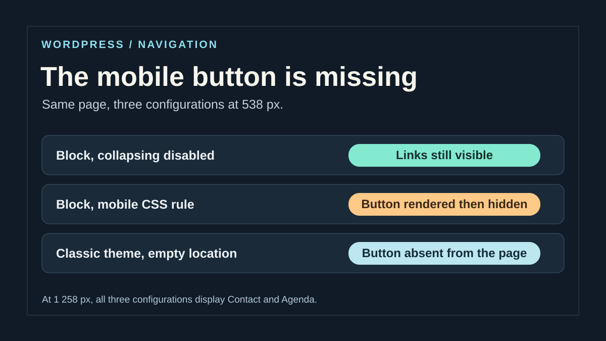
On the copy, compare three states of the same page: overlay disabled, mobile mode and any CSS rule hiding the button. At each width, record whether the button exists in the DOM, is visible and makes links accessible after activation.
An absent button points to block or theme rendering; a present button with display: none points to the applied rule and its context. For a classic theme, separately check mobile-location assignment if the theme provides one.
Reproduce this protocol on your theme. After correction, confirm on a real phone and an internal page with the panel closed and open. Visual disappearance of the incident is validated only if links and closing are also usable.
Confirm the public correction and keep the right reference points
If the editor shows the correct menu but public visitors retain the old display, ensure you saved the template or part actually in use. Then reload the page and refresh the affected cache with the existing tool. Avoid adding another caching plugin to fix an incorrect navigation setting.
Compare addresses, session and width before interpreting a difference. A logged-in user may receive another state or use a different cache from a visitor. The administration bar may also reduce visible space. Keep a logged-out check as the correction's control.
Document the template, header part, chosen menu and collapse mode. For a classic theme, record the location and assignment. With a plugin, record the integration and actual threshold chosen. This information avoids rebuilding the menu during the next appearance change.
If the problem persists, provide a page, failing width range, navigation type and rule or setting already checked. State whether the button is absent, invisible or present without opening. This distinction keeps further work on the correct issue without multiplying contradictory header corrections.
Check widths where the menu changes form
A responsive breakpoint is measured in CSS pixels, not merely the phone's advertised resolution. After correction, test just below the breakpoint, at it and just above, then increase browser text size. The important case is a width where long links and the logo compete with the button.
Keep the menu's actual language during testing: temporarily replacing ‘Nos accompagnements personnalisés’ with ‘Services’ may hide the space problem. If the panel contains many links, check scrolling and that a way to close it remains available.
The Navigation block and theme settings remain the first free solutions. Max Mega Menu concerns a compatible classic location; installation does not automatically convert a Navigation block into a theme menu. Keep one system active for the corrected area and check that no invisible button remains reachable with Tab.
Sources and references
Use these references to check the features, requirements and limitations described. Reading documentation is not a practical test.
View 14 references
- Navigation block and mobile overlay ↗
- Choosing a menu and block display ↗
- Classic menus and locations ↗
- Shared template parts ↗
- Site Editor and templates ↗
- Styles and additional CSS ↗
- Inspecting computed styles ↗
- Mobile simulation and its limits ↗
- Accessible navigation and submenus ↗
- Max Mega Menu: product and compatibility ↗
- Installing and integrating Max Mega Menu ↗
- Max Mega Menu mobile display ↗
- WordPress — display a menu at its location ↗
- WordPress — check a location's assignment ↗