

Distinguish a stretched, cropped or genuinely blurry logo
A logo may look sharp in the media library and unrecognizable in the header. If it appears too wide or tall, its proportions have probably changed. If part of the symbol is missing, look for cropping. If edges and lettering become soft while the shape remains correct, compare the file actually loaded with the size at which it is displayed.
The aim is to restore the intended design within the available space without artificially enlarging a small image or rebuilding all navigation. Start with a specific public page and a screenshot at the width where the fault appears. Also check whether the problem exists immediately on loading or only after scrolling, when a compact header may take over.
A different editor display does not prove the original is damaged. The preview may use another setting or image size. Conversely, a file already blurry at its actual size cannot recover details through a CSS rule. The correction must therefore target the fault’s source.
Keep the original file and current setting before starting. If the header is shared, work on a copy or check every relevant page before applying the change. A logo fixed on the homepage may become too large on an internal page or mobile.
Identify the element displaying the logo
With a block theme, open Appearance → Editor and the template or header part used by the page. List View helps select the exact block. Distinguish Site Logo from Image: the former represents global identity, while the latter may be an image specific to this structure.
Replacing a Site Logo block’s image may change other occurrences of that logo. Changing the block width concerns presentation, and a shared header part may itself be used by several templates. These two sharing levels explain why an apparently local fix may appear elsewhere.
With a classic theme supporting custom logos, check Appearance → Customize → Site Identity. Some themes use their own header panel; then use the one actually producing the logo. A third-party builder’s path depends on that product and cannot be inferred from native menus.
Record the part name, block type and selected image. If the fault affects only the scrolled header or phone view, look for the variant intended for that state before replacing the main identity. An additional logo is not necessarily corrected in the same place as the desktop logo.
Compare the original with display dimensions
Open Media → Library, then the selected file’s details. Record its pixel dimensions and open the file to examine it at actual size. A 160-pixel-wide image displayed at 320 pixels must be enlarged: the browser cannot recover missing detail. A large transparent margin around the design also reduces the space actually occupied by the symbol.
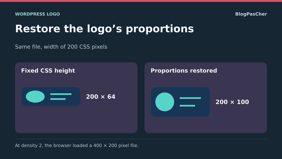
Compare width-to-height ratios. A 600 × 200 file has a three-to-one ratio. A 240 × 80 display preserves that ratio; a 240 × 120 display distorts it if the image is stretched into that box. These values are calculation examples, not mandatory dimensions for a WordPress logo.
On the public page, right-click the logo and choose Inspect. Select its img element in browser tools, then inspect dimensions and computed styles. Look for a width, height, ratio or transform that could explain the resulting shape.
- Record the original file’s size and shape.
- Measure the displayed space on the relevant page.
- Compare proportions before changing the image.
- If shape is correct but edges remain blurry, continue to the file actually served and screen density.
Correct the Site Logo block’s width
This approach suits the correct file being selected but displayed too large or small. It requires permission to edit the relevant template or part. In the Site Editor, select Site Logo in List View, then open its Settings in the sidebar.
The Image width control provides a slider and numeric value. Record the existing value and choose a width suited to the header space. Start by changing only this value: simultaneously changing spacing, file and alignment would prevent identification of the useful fix. Save the objects actually concerned in the save panel.
The expected result is a proportionate design at the new width. Check the public page and another page using the same header. If the logo remains stretched despite a reasonable width, a height or layout rule may still impose distortion; move on to inspecting styles.
To undo, restore the initial width and save. Do not use Replace solely to adjust a dimension, because that action changes the logo source. The Use as site icon option also concerns browser tabs; it is unnecessary for adjusting the header.
Restore an Image block’s proportions
If the header contains an ordinary Image block, its controls differ from Site Logo. Open the relevant template, select that block and its sidebar. In available dimension and aspect-ratio settings, record width, height, ratio and fitting mode before changing them.
To display the design without distortion, set the useful width and leave height automatic where that choice is available. If an imposed ratio crops the symbol, return to the original ratio or a mode showing the entire image. When the interface offers Contain and Cover, Contain keeps the full design inside the box; Cover may crop portions to fill the space.
If you must retain a fixed-size box, accepting empty space may be preferable to cropping the brand. Contain does not remove transparent margins already in the file. Nor can it restore a portion removed from an image cropped earlier.
- Edit the identified block without touching other template images.
- Adjust width and let height follow the proportions.
- Check the complete symbol in the editor and public page.
- If the test fails, restore the four recorded values before looking for a competing CSS rule.
Check a classic theme’s logo without editing its files
For a classic theme, an administrator can generally open Appearance → Customize → Site Identity and find the selected logo. If one already exists, the button lets you change it; keep the current file before choosing another image. Depending on the interface, saving is labeled Publish or Save Changes.
A theme may impose a cropping area or provide a specific width. Expected dimensions and cropping flexibility come from its custom-logo support. Do not add a snippet to functions.php to impose a size without knowing that theme’s settings and rendering.
If the file is correct, keep it and first look for the documented width or height control in the theme’s header panel. Change one value, check the preview and then the public site. Without a control, CSS inspection can determine whether a small targeted fix is appropriate.
The result must retain the design’s proportions on main pages. To roll back, select the previous logo or restore the initial value. Do not delete the old media: it provides rollback and may still be used in another header variant.
Replace an undersized source with a suitable export
This approach suits a file that itself lacks definition or already contains incorrect cropping. Find the original design document or ask the brand owner for a suitable export. Enlarging an existing small image does not recreate its edges. Print resolution, sometimes expressed in DPI, does not replace the actual pixel dimensions needed for web display.
For a bitmap source, export an image large enough for the intended dimensions, with the same ratio and controlled margins. A transparent PNG may suit a logo that must remain readable on several backgrounds. Examine small lettering and edges against the actual header background, not only a graphics program’s checkerboard.
Upload this new export as separate media without overwriting the old file. In the identified block, use Replace and select this media. For a global logo, check other occurrences; for an Image, check shared-part uses. Retain the intended display width instead of letting the new file enlarge the header.
The expected result is greater sharpness at the same size. If the design remains blurry, check that the browser actually receives the new export. To undo, reselect the previous media. A validated SVG file may meet other needs, but changing format or permitting its upload is not essential to fix incorrect sizing.
Check the served file and high-density screens
The displayed file may differ from the library original. WordPress or an optimization tool may offer several sizes, and the browser chooses a resource according to the page’s instructions and its context. In developer tools, open Network, filter images and reload the page. Find the logo through its preview and open the corresponding resource.
Compare its dimensions and quality with the original. A 150-pixel thumbnail may explain a poor result even if the initial file is very large. For an Image block, Resolution may offer Full Size, Large or another available size. Try a source suited to display, then recheck the request. The Site Logo block does not necessarily provide this same menu.
On a screen where one CSS pixel corresponds to two physical pixels, a logo displayed 200 CSS pixels wide may benefit from a 400-pixel-wide file. This is a sizing example, not a sharpness guarantee or rule imposing an enormous file everywhere. Browser zoom may also change test conditions.
If an optimized variant is degraded, compare both files at identical dimensions before blaming compression. Correct that variant’s setting in the existing tool, or exclude this image only if the tool permits it. Do not regenerate the entire library or disable all optimization for one logo without identifying the faulty resource.
Correct a confirmed CSS height on only the relevant logo
This technical option suits inspection establishing that a fixed CSS height distorts a Site Logo block and the native width setting already works. In computed styles, temporarily disable the height rule to check that the shape becomes correct. Reloading cancels this test. Prefer correcting the original rule when it belongs to your custom CSS.
If an additional rule is justified, select the Site Logo block in the editor. In Advanced → Additional CSS class(es), add logo-proportionnel without a dot, retaining other classes. The example below targets the image inside only this block type bearing that class; it is unsuitable for a background image or logo produced by another component.
Place the rule in the site’s Additional CSS: Appearance → Customize → Additional CSS for a classic theme, or Appearance → Editor → Styles → three-dot menu → Additional CSS for a block theme. Do not paste it into a field expecting only properties for a block type.
Check that this rule actually wins in computed styles. If a more specific, important or inline rule takes precedence, fix its source instead of stacking !important declarations. The expected result is a height calculated from width and file ratio. To undo, remove only this rule and the added class. The code does not sharpen an undersized image.
.wp-block-site-logo.logo-proportionnel img {
  height: auto;
}
Distinguish file margins from display cropping
A logo may seem tiny despite a large width because its file contains substantial transparency around the design. Enlarging the block also enlarges this margin and may interfere with the menu. Open the image alone to identify the file and symbol boundaries before changing dimensions.
If margins need reducing, prepare a new version from the original. The image editor accessible through the block’s crop button lets you select an area and save the edited version; recent versions retain the original in the media library. Nevertheless, check the file and block you are editing, because the older media-editing screen follows another workflow.
Keep enough margin to avoid cropping a letter, accent or edge. The aim is to use available space better, not force the symbol to fill a square. If the entire design is visible in the file but cropped only on the page, return to the block’s ratio and fitting mode.
Compare the new version at the same width, then choose the old media through Replace if the result is unsuitable. Delete no files at this stage. Reducing margins does not fix missing pixels in an already small source.
Handle mobile variants and the scrolled header
If the fault appears only on a phone, first check which logo is visible at that width. Some themes display another image or header group. A desktop logo correction may therefore have no effect. Repeat identification on the logo actually displayed, then compare its file and dimensions.
Also examine neighboring elements. Excessive logo width may leave too little room for the menu button. A fixed row height may crop the image even if its own ratio is correct. Correct the identified value in the group layout or theme panel, retaining the previous value.
Test the page at the top and after scrolling. A shrinking header may apply another rule or load another file. Also check light and dark backgrounds if the logo changes appearance between those states. A white version on a light background is a variant choice issue, not blurriness.
The expected result combines a complete logo and usable navigation without horizontal overflow. Return to the previous setting if the menu shifts or another width worsens. A mobile editor preview helps prepare the correction; confirm it on the public site and, where possible, the affected phone.
Check the result before retaining the correction
After saving, reload the page as a logged-out visitor. If the old image persists, compare the served URL before a targeted purge with the existing cache tool. Changing the file, adjusting width and purging every layer simultaneously would make the actual cause difficult to identify.
Check sharpness at the intended width, proportions, complete symbol and contrast against the background. Test the logo link, then the adjacent menu with keyboard and mobile. Check at least one internal page using the same header part and any scrolled variant.
Keep the export dimensions, display width and logo configuration location. This information helps reproduce the setting after a theme change or migration. An image optimization or regeneration plugin does not replace this record; it cannot recreate detail missing from your original.
If the fault remains unexplained, provide the page, screen width, original file, actual served URL and a screenshot of the relevant setting. These details let the correct component be examined without changing the entire header. Keep the old media and starting values until these checks finish.
Measure the displayed logo before changing the file
To distinguish distortion from insufficient definition, compare the file ratio with the displayed frame. Temporarily uncheck a suspected fixed height: if proportions return, that rule explains the distortion, but the file may still be too small to remain sharp.
On your copy, inspect the visible logo in the public header. Record displayed width and height in developer tools. In Network, identify the image loaded at this width and open that file to read its dimensions. If ratios differ, find the block or theme rule forcing height. Temporarily uncheck that rule in the inspector and compare without changing the selected image. If the logo regains its proportions, apply the correction in the relevant source setting or stylesheet. Reload the page to cancel the temporary test.
Check the file actually served on a dense screen
As a calculation example, a logo displayed 200 CSS pixels wide on a density-2 screen may benefit from a 400-pixel-wide source. This estimate does not prove which variant the browser chooses. Record the file actually received and compare it with the retained block width.
On your site, start by checking the loaded resource before exporting another file. A well-defined source may be available in the media library while another variant is delivered in the header. If the source is too small, prepare a new export from the design or reference file, retaining intended proportions and margins. Import it as new media and keep the old one so you can reselect it.
Preserve the link and check rollback
After replacement, test the logo at the problematic width and another width. Check proportions, alternative text where intended and link destination. For a header changing on scroll or phone, inspect the logo actually visible in each state. If the new export takes too much space, first recheck block width. To undo, reselect the previous media and check the loaded file. Chrome density simulation helps compare variants, but supplement the check on the actual affected screen.
Keep block width after an identity change
Replacing the site logo changes the common image, while width remains a presentation setting of its occurrences. Before replacement, therefore record media and width in the main header, then in a mobile or compact variant if present. A larger new export must not automatically increase the space reserved for the brand.
In the Site Logo block, use Replace for the source and the width setting for presentation. Check the use-as-site-icon option separately: the favicon serves another purpose and must not be changed merely to fix the header. For branding specific to one page, check whether a local Image block is more suitable than replacing global identity.
After saving, open at least two page templates and test the logo link and neighboring menu. The expected result combines sharpness, proportions and enough navigation space. The native approach is free; a compression plugin does not recreate details in an undersized file. To roll back, reselect the old media and restore only widths actually changed.
Sources and references
Use these references to check the features, requirements and limitations described. Reading documentation is not a practical test.
View 16 references
- Site Logo block ↗
- Image block dimensions, resolution and aspect ratio ↗
- Classic logo and Site Editor ↗
- How the logo works in a classic theme ↗
- Edit an image and preserve the original ↗
- WordPress media editing ↗
- Resizing and quality ↗
- Shared template parts ↗
- Image source selected by the browser ↗
- Screen pixel density ↗
- Fitting an image inside its box ↗
- Image rendering algorithms ↗
- Computed styles and rule priority ↗
- Requests and served resources ↗
- Additional CSS in styles ↗
- W3C CSSWG — Browser pixel density ↗