

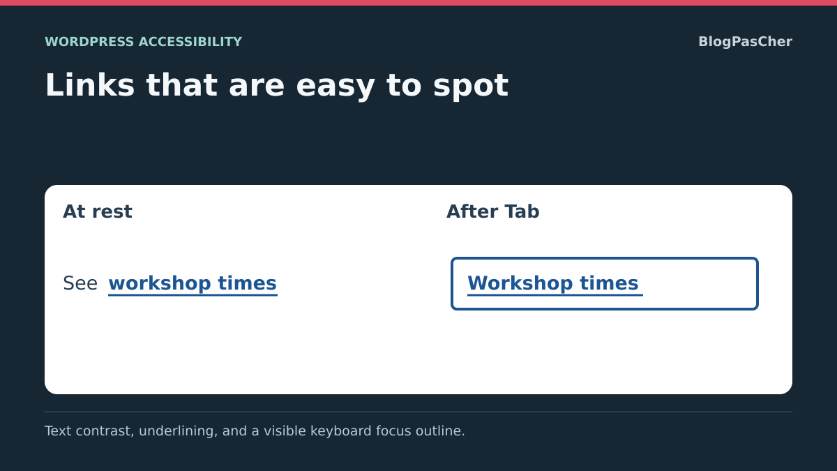
Distinguish three reasons a link is hard to identify
A link may be hard to read because its color blends into the background. It may also be readable but indistinguishable from ordinary text, or become impossible to locate when selected by keyboard. These three problems require separate checks: text contrast, link cue and focus indicator.
The desired result is a readable, recognizable link before interaction whose keyboard state remains visible. A new color does not automatically fix missing underlining or a removed outline. Conversely, underlining does not make text readable when too pale against its background.
Choose concrete examples: a paragraph link, footer link, navigation on a dark background and a link inside a colored block. Record relevant states: normal, hover, keyboard focus and any visited state. One white-background example does not represent the entire site.
Retain initial colors and rules before starting. Global styles may affect many pages while a block may have its own override. Prepare a copy for shared changes and retain a correct reference page. You can then fix the right scope and undo the change without resetting the entire appearance.
Understand measurements without confusing them
Contrast compares the luminance of two colors. For ordinary text, the WCAG minimum contrast benchmark is 4.5 to 1 between text and background; a 3-to-1 exception applies to large text. Use the case suited to actually displayed text instead of calling a small link large merely because it is important.
Recognizing a link is another question. In a paragraph, permanent underlining provides a cue beyond color. An effect appearing only on hover does not help someone first looking for where to click or using a touchscreen. Also retain understandable labels.
Focus indicates the element ready to receive keyboard action. Its outline must remain visible during that workflow. For a custom indicator, contrast against adjacent colors is part of verification; the 3-to-1 non-text contrast benchmark does not replace the text benchmark.
These criteria are not an interchangeable global score. Passing a two-color comparison proves neither keyboard navigation nor complete page accessibility. You will therefore measure colors, check cues and perform a keyboard sequence, then retain the correction addressing the observed fault.
Measure actually displayed colors without installing a plugin
In Chrome, right-click the public link and choose Inspect. In Styles, click the color square for its color property to open the picker. The contrast section, when available, compares this color with the corresponding background. Computed values help locate the rule actually applied.
Record both colors and the indicated ratio. Transparency, a background image or gradient requires checking the actual background behind text; a simple pair of values selected in the editor may not represent this composition. Test several positions if the background varies beneath the link.
You can try another picker color to test a hypothesis. This change remains temporary in the browser and disappears on reload. Record the suitable value, then apply it through its original WordPress setting instead of considering the test saved.
The text picker does not automatically check every outline and site state. Repeat keyboard testing specifically for the focus indicator.
- Select the relevant link text in its normal state.
- Record the winning color, background and available ratio.
- Compare a candidate color against this same background.
- Also check other backgrounds where this style is used.
- Keep starting values to undo the subsequently saved correction.
Correct global link color in native styles
With a block theme, open Appearance → Editor → Styles → Colors. Under elements, choose Links. Record the current color and apply the value verified against the relevant background. The panel also lets you adjust hover where available. Check that state without confusing it with keyboard focus.
This change concerns links inheriting the global style. It may therefore change pages you did not open. Check at least ordinary content, the footer and a block with another background before retaining it. A local style or more specific rule may still override the global value.
Save changes and check the public page logged out. The expected result is readable color in targeted areas without degrading other backgrounds. To undo, restore initial values, including hover if changed. Resetting every style would exceed this correction.
With a classic theme, find the link-color control actually provided in Appearance → Customize or documented theme options. Its name is not universal. If no relevant setting exists, use the identified original CSS or a targeted correction without switching themes solely for this color.
Correct a local override on a block or group
If only one box remains unreadable after the global correction, select that block or parent group in the editor. Record its background and colors imposed on links. A choice suited to text on white may be unsuitable in a dark panel, and an inherited value does not necessarily come from the global setting.
In the WordPress 7.1 interface, the Elements panel allows, among other things, customization of nested link colors in containers such as Group. Select the container in List View, open its sidebar and find this panel and the offered link setting. Controls depend on the block and environment.
Restore a local color verified against the local background or remove only the override if global inheritance is appropriate. Keep initial values for rollback. An editor contrast warning helps, but no warning does not validate every composition and state.
After saving, examine the group on the public site and other uses of this structure if shared. The result must be readable in its actual context. If color does not change, identify the winning computed-style rule instead of multiplying conflicting values across settings levels.
Add targeted underlining to text links
When paragraph links remain difficult to recognize, permanent underlining provides a direct cue. It complements readable color; it does not compensate for insufficient text contrast. First check whether a link-specific decoration setting already exists in your theme.
If the necessary control is missing, select the paragraph or a group containing only relevant text. In Advanced → Additional CSS class(es), add liens-lisibles without a dot or removing other classes. The rule below targets descendant links of this block. Avoid placing the class on a group also containing navigation or buttons if you do not want them underlined.
Place the complete rule in site Additional CSS: Appearance → Customize → Additional CSS for a classic theme, or Appearance → Editor → Styles → three-dot menu → Additional CSS for a block theme. Do not paste it into a field expecting only properties for a block type.
Check underlining at rest, on hover and with keyboard, then ensure no unlinked text accidentally received the same decoration. The result is a link cue visible before interaction. To undo, remove only this rule and the added class. If a higher-priority rule cancels underlining, identify and correct its source instead of adding general exceptions.
.liens-lisibles a {
  text-decoration: underline;
}
Restore a visible focus outline in the relevant area
Navigate links with Tab without using the mouse. If no indicator appears, look for a custom rule removing outline or replacing focus with an invisible effect. Temporarily disable it in the inspector to check whether the theme’s intended outline returns. Correcting this source may suffice.
For a specific outline, add focus-lisible to the relevant block or group’s additional CSS classes. The rule below targets its links when the browser determines a focus indicator should be shown. Blue is an example for a light background; check contrast against actual adjacent colors and adapt if needed.
Place the rule in the site Additional CSS described earlier. It must not replace menu-opening or closing logic. Nor does it make a noninteractive element keyboard-usable: target real links already in the navigation sequence.
Test the outline against every background in the area, at the beginning and end of a text line and in a list. Check that no parent clips it. If a priority rule cancels it, correct that identified rule instead of removing focus styles from the rest of the site. To undo, remove only this rule and the added class.
.focus-lisible a:focus-visible {
  outline: 3px solid #174ea6;
  outline-offset: 3px;
}
Check variable backgrounds and link states
A link may appear in several contexts: white footer text, colored box, cover image or navigation panel. Test its color against the least favorable background encountered, not only the one making a screenshot clearest. A gradient or image may require a more stable text background instead of one link color assumed to work everywhere.
Compare normal, hover and focus states. A hover color change must not make text disappear. An outline must not blend into an existing border. Also check visited links when your theme gives them a specific appearance, without relying on one automatic style reading to validate every state.
If an area uses an intentional dark variant, retain an appropriate local setting instead of imposing the global light-context color. Record the initial value and check other elements inheriting from the same group. The correction must remain readable in every intended state.
The expected result is consistent cues in actual contexts. To undo a test, restore the retained color, background or state. A regularly changing photograph beneath links must be treated as a variable context to maintain, not a fixed background permanently validated.
Option: measure colors with WP Accessibility
WP Accessibility, by Joe Dolson, provides a two-color contrast test and other tools and fixes. Verified version 2.4.5 requires WordPress 6.4 and PHP 7.4 minimum and declares testing up to WordPress 7.1.4. This free plugin does not guarantee a site’s general accessibility.
It may be useful if you want to test color pairs in administration. Browser tools remain the route without installation. Before adding the plugin, preserve site state and test on a copy; examine existing and default settings because its functions extend beyond this test.
A two-value test does not automatically reconstruct transparency or a background image. The plugin also has a broadly scoped focus-outline option; do not enable it as a substitute for examining areas and existing styles. If you use no other features, deactivating only the new plugin undoes the test, followed by checking restoration of initial behavior.
- In Plugins → Add New Plugin, search for WP Accessibility and verify the author.
- Install and activate the plugin on the copy.
- Open WP Accessibility → Testing & Admin.
- In the contrast tester, enter text and background colors as hexadecimal values.
- Run Check Color Contrast and record the ratio for this pair.
- Check that both values match actual display before retaining a color.
Check that focus is not clipped or covered
A well-contrasted outline may remain unusable if clipped by a group or hidden behind a fixed header. Navigate the page by keyboard and observe the element actually reached, including near the top of the screen, inside boxes and open panels.
If a parent clips the indicator through an overflow rule, confirm this cause with a temporary inspector test. Then correct the original setting or rule, retaining its value. Removing every overflow limit on the site could reveal other deliberately hidden elements; target the relevant container and check its other functions.
If a banner covers the reached element, adjust that banner’s layout or fixed behavior on a copy. The minimum focus-not-obscured criterion addresses, in particular, a component entirely hidden by site-created content. Your practical check must let you identify and activate the link, not merely observe a few visible pixels.
The expected result is readable focus and a reachable target in context. Check menu opening and closing after correction. To roll back, restore the retained container or banner setting; a new global mask is not a reliable rollback solution.
Validate links as a visitor and with keyboard
After saving, reload the public page logged out and revisit the initial examples. Check text against its actual background, the preinteraction link cue and keyboard outline. A correct editor state is insufficient if a different public rule applies.
Use Tab and Shift + Tab, then activate a few destinations. On a phone, check link recognition without relying on hover. Increase zoom and check that the cue remains perceptible without covering letters or leaving a clipped area.
If old rendering persists, confirm the correct object was saved before refreshing the relevant cache. Keep measurements and steps actually performed. These checks concern examined links and states; they do not justify claiming a complete audit, universal score or general site compliance.
- Compare text contrast against each representative background.
- Identify paragraph links before hovering over them.
- Navigate links and controls using only the keyboard.
- Check panels, footer and dark-background areas.
- Check that correct styles remain on reference pages.
- Restore the retained value or rule if a global change degrades another context.
Maintain a palette and rules that are easy to manage
Record color pairs used, their background, state and setting location. A palette name alone does not describe every combination: the same color may work on one background and fail on another. Retain initial values and targeted rules until correction is validated.
Define a simple editorial rule for text links, such as permanent underlining with readable color. Keep ordinary-text decoration distinct to avoid false visual links. For focus, retain a consistent indicator perceptible in light and dark areas.
Revisit reference pages after changing themes, palettes or builders. Check new boxes and images placed beneath linked text. A background change may invalidate a previously satisfactory pair without changing link color.
If further intervention is necessary, provide the page, relevant state, measured colors and style source. Specify whether the problem is text reading, link recognition or focus. This diagnosis fixes the correct cue without replacing the entire appearance or attributing a guarantee a plugin cannot provide.
Repeat keyboard navigation at two widths
On a copy, prepare two low-contrast links on white and a reference link outside the corrected area. Measure actual contrast, then apply the chosen color, underlining and 3-pixel focus outline. Recheck contrast and keyboard navigation. The outside control must retain its color. Record measurements instead of assuming a color named “blue” reaches a given ratio.
Check the selected color pair against the exercise’s white background. Measure colors again against a dark background, image or colored box. A ratio measured on white describes only that combination.
- At 320 CSS pixels, then on desktop, navigate the area with Tab. Underlining must be visible before interaction. The outline must indicate the focused link and remain readable around text, including near a group edge.
- Move to the second link, return to the first with Shift + Tab and open its destination with Enter. Compare this sequence against other theme backgrounds and with a fixed bar displayed.
- Temporarily disable added rules and check that the original state returns. If the outline is still clipped, inspect parent height, overflow and margins before adding another rule.
Choose the contrast threshold from actual size
In the WCAG benchmark, large text means at least 18 points, or 14 points bold, with equivalents adapted to the scripts concerned. For ordinary CSS, this is approximately 24 pixels, or 18.7 pixels bold. A 16-pixel navigation link therefore does not qualify for the exception merely because it is an important heading.
Record computed browser size, weight and background, then use the corresponding threshold. For an ordinary link, retain 4.5 to 1 as the minimum; do not reduce the requirement based only on personal browser zoom. Thin or unusual fonts may remain hard to read despite a conforming ratio. Keep a readability margin and always check underlining and focus separately. This clarification helps interpret the free tester already described, not claim global compliance.
Sources and references
Use these references to check the features, requirements and limitations described. Reading documentation is not a practical test.
View 13 references
- Do not convey information through color alone ↗
- Minimum text contrast ↗
- Non-text indicator contrast ↗
- Visible focus ↗
- Focused element not entirely obscured ↗
- Block and nested-element color settings ↗
- Global link colors and Additional CSS ↗
- Block typography and decoration ↗
- Chrome color picker and contrast ↗
- Chrome contrast diagnosis ↗
- CSS focus-visible ↗
- WP Accessibility: product and tools ↗
- Official WP Accessibility 2.4.5 code ↗