

Recover the cropped subject without changing every image
A portrait’s face disappears in a post card, a product no longer fits the banner or a featured image looks correct on desktop but cropped on a phone. The desired result is keeping the useful area visible in the affected locations with a readable composition at several widths.
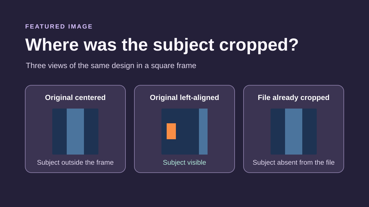
The defect may come from the file itself, a cropped variant or how the theme fills its frame. These three causes are corrected in different places. Before changing dimensions across the library, choose a reference post and compare what the file contains with what the page reveals.
The same featured image may serve the post, archives, search results and other presentations. A good correction accounts for these uses. Changing the file may affect several locations, while a template setting may affect many posts.
This approach concerns a poorly framed subject. If the image returns 404, first restore the file or address. If the theme’s required variant does not exist, examine generation. A position setting cannot recreate an area already removed from a file, and regeneration does not necessarily change an overly narrow display frame.
Compare the source, served file and visible frame
Open the post in administration and view its featured image. In the media library, open the main file to see whether the entire subject remains. Keep an original copy and record the selected media name. Do not treat an interface thumbnail as proof of source framing.
On the public page, open browser tools and record the displayed file’s request. A variant may have a different name and dimensions. Open that address separately. If the subject is already absent from this file, shifting its display will not bring it back: you need another variant or a suitable source.
If the file contains the subject but the page crops it, inspect the image in Elements and its computed styles. Look particularly for height, aspect ratio, object-fit and object-position. A frame filled with cover may hide edges to preserve image proportions.
Also compare the post with its card in the blog list. They may request different files or frames. Record precisely where cropping occurs: a single template, a post loop or a specific component. This inspection should produce a probable cause and scope without yet replacing media or saving CSS.
Choose the correct scope before saving
With a block theme and design permissions, display settings are often under Appearance → Editor in the template containing the featured image. With a classic theme, first look for the provided function in theme options or Appearance → Customize when available. Controls depend on theme and account permissions.
For an image issue affecting every post using a template, a template correction may suit. For a single photo with an off-center subject, changing position globally may worsen others. Prefer a better-composed source or a correction limited to that publication.
Before a template change, preserve its current settings and a recoverable copy. Record the template actually assigned and several reference posts. Before replacing a post’s image, keep the previous reference. This preparation enables targeted rollback instead of a general theme reset.
On WordPress.com or another managed plan, design and CSS features depend on available access. On multisite, the network administrator may restrict them. Do not install a plugin to bypass a missing control: first identify who manages the template and whether your intervention concerns a post, a card group or the whole site.
Approach 1: adjust the frame in the relevant template
With a block theme, open Appearance → Editor → Templates, then the template actually used by the affected page. Use List View to select the Featured Image block. In a post list, it may be inside a Query Loop and its Post Template: verify that context before changing it.
In block settings, record aspect ratio, width, height and scaling when offered. First try a ratio closer to your source or its original proportions if suitable for the presentation. If a fixed height forces a very narrow strip, examine its usefulness instead of shifting the subject endlessly.
Cover fills the frame and may hide edges. Contain shows the entire image but may leave space when proportions differ. Choose according to editorial need: a complete product listing and portrait gallery do not necessarily require filled cards at any cost.
Preview several posts, then save only intended items. Changing this block in a shared template affects publications using it. To undo, restore recorded values in the same block or its preserved version. Do not reset the entire template to erase a single height or scale attempt.
Do not confuse image selection with display settings
The Post or Page panel selects featured media. It does not automatically define cropping for every representation. The dynamic Featured Image block displays that media according to post context and template settings. An archive card and post header can therefore show the same source in different frames.
The Image block inserted in content has its own controls. Recent versions may offer a focal point with an aspect ratio, particularly useful with Cover scaling. This does not mean the same field exists in the featured-image panel or every theme component.
If your screen has no focal point, identify the selected block and theme-provided functions. Do not search for a universal button or turn a dynamic image into a fixed image merely to obtain a control. In a post loop, a fixed image could repeat across several cards instead of showing each publication’s own image.
Also preserve links and useful information during correction. Changing composition must not remove the click destination, relevant alternative text or necessary caption. Check these in public context, not only the isolated media preview.
Approach 2: assign a composition suited to one post
This approach applies when the photo’s subject does not suit the intended frames or the available file is already cropped. Prepare a new composition from the preserved original with enough space around the subject. If several formats are used, choose an important area that remains readable in the main crops.
Create a separate recognizable file. Do not silently replace the shared media-library file: one resource may serve several posts, pages or documents. A composition dedicated to a post portrait must not change a photograph used elsewhere without checking.
In Posts → your post, open post settings, then Featured Image. Use replacement or media selection to assign the new file, then save the post. Exact wording depends on the interface, but check that you are changing the post’s media, not merely an Image block in its body.
Then check the blog card, post and other locations representing that publication. To undo, select the previous media again and save. Keep the old source until checks finish. Removing an image from a post does not justify deleting its media-library file, because another use may still depend on it.
Approach 3: shift the displayed crop with scoped CSS
This approach applies only if the served file still contains the subject and inspection confirms an image filling its frame with object-fit: cover. It requires Additional CSS access and element identification. It does not suit a background image or a variant already missing the desired area.
On the affected Featured Image block, open Advanced → Additional CSS class(es) and add cadrage-sujet, without a dot. In the example, the class belongs to the template block, but the rule is limited to single-post display for post 123. Replace that number with the verified ID and confirm postid-123 is present on the body element using the inspector.
Add the complete rule in site Additional CSS: Appearance → Editor → Styles → three-dot menu → Additional CSS, or the location provided by your classic theme. Do not paste it into a field expecting only block-type properties. It preserves existing scaling and shifts the visible area upward.
The 50% 20% values are an illustrative starting point, not automatic face detection. Try positions in the browser before saving. If a higher-priority rule prevents the effect, find its source rather than immediately adding !important. To undo, remove only this rule and the class if no longer useful.
body.postid-123 .cadrage-sujet img {
  object-position: 50% 20%;
}
Check scope on cards and phones
The preceding rule is limited to the individually opened post. It does not automatically fix its archive card because the list page has another context. If the defect lies in a post loop, examine that loop’s block and decide whether the same setting suits every image before applying a shared scope.
An ideal portrait position may crop an object placed lower in another photograph. Do not generalize a setting learned from one media item to every post. For a series with very different compositions, a less restrictive ratio or consistently prepared sources may be easier to maintain than many CSS corrections.
Compare several page widths, especially the transition from a horizontal card to a narrower one. Observe the subject as well as overlaid text, link and margins. A face becoming visible is insufficient if the title covers it on a phone.
Avoid randomly copied mobile breakpoints. First identify when the frame actually changes in your theme. If width-specific settings are needed, have them defined for this component and retain both reference states. One position cannot always satisfy two very different compositions.
If cropping is already present in the generated file
When opening the served file already shows cropping, CSS cannot recover its edges. Compare it with the preserved source and record the image-size name used. A theme may define a variant with center cropping or a position determined during generation.
Check whether an uncropped or better-suited variant is already available in the displaying component. Changing selection may suffice provided resolution and proportions remain suitable. Do not change the three general sizes in Settings → Media to correct one custom theme size.
If the size definition must change, have the theme maintainer identify its origin and scope. The correction must survive updates and remain consistent with the template. Directly changing a parent theme file without tracking risks losing the adjustment at the next update.
After a confirmed definition change, first regenerate one media item’s size through the missing-variants approach. Preserve files and metadata as well as old sizes still used. This operation is a separate write from a template setting: switching themes or removing CSS does not automatically undo it.
Choose a composition compatible with important uses
A very wide frame and a square frame cannot always show the same details of a tightly cropped photograph. Identify what must remain visible: face, entire object, lettering or the area carrying the main information. This editorial choice determines whether to show the whole file or accept cropping secondary areas.
When essential lettering sits at an image edge, simple crop positioning remains fragile. Prefer a composition with enough margin or also present that information as page text. Visitors must not depend on an edge disappearing whenever the card changes proportions.
If you choose Contain to preserve the entire image, check the component’s color and space around the file. Empty bands may be acceptable for some content but should remain consistent with other cards. Do not distort the image by forcing two incompatible dimensions to eliminate them.
No plugin is needed for the template settings, media selection and targeted CSS described here. If your theme already has per-post cropping, check its effect across locations before using it. Adding a second image-management system is unjustified while these settings cover the need.
Validate the result and keep precise rollback
Reopen the reference post, blog list and a relevant archive after saving. Check several widths and a logged-out session for public content. Verify the file loads, the important subject stays visible and the image link retains its destination. A correct editor preview does not replace these public checks.
Examine at least one other post using the same template. This shows whether a frame change improved the reference while worsening another composition. If the browser or page cache still shows the old output, check saved settings and the resource before targeted purging with the existing system.
Finally record what changed: assigned media, block values, shared template or CSS rule. Rollback paths differ. Reassigning old media undoes source replacement; restoring block values undoes the frame; removing the rule undoes the CSS shift. None of these actions undoes separate file regeneration.
Keep originals and previous references until important uses are validated. For future posts, leave margin around the subject and check the image in main frames before adopting it. This reduces individual adjustments without forcing one composition on every photograph.
Open the file the browser actually loaded
To distinguish CSS cropping from a cropped file, choose a source with a recognizable detail near an edge. Compare the file opened alone with its display in the template frame. Keep the same file during the position test, then check a second width.
On your copy, open developer tools and select the featured image actually displayed. In Network, filter images and record the file address loaded at the problematic width. If the site supplies different sources by screen, repeat at the second width. Open the identified file in another tab and look for the cropped area. Also compare with the image preserved in the media library. This locates the stage at which the edge disappeared.
Check whether to correct the frame or variant
A square variant cropped during generation may have lost a detail present in the source. Open that variant separately: if the detail is absent, object-position cannot restore it. Return to a variant retaining the subject or prepare suitable regeneration.
If the file still contains the subject, temporarily try another position in the browser inspector’s Styles. Keep the same file and check framing at the failing width. After a satisfactory result, port the rule into the CSS source for only the affected template or block. If the served file already lost the edge, choose a retaining variant in the component. Then verify it has sufficient resolution for the frame. Changing a custom size followed by regeneration may help when no suitable variant exists.
Repeat comparison on the page and its card
On the copy, check the opened post and, if present, the card linking to it. For each context, record tested width, loaded file and visible subject area. A post-template correction may leave card rendering unchanged because the card may request another variant or use another frame. If a targeted correction improves the post and worsens the card, restore the previous rule or limit scope to the confirmed context.
A CSS position change modifies display without rewriting the image file; separately verify any generation or replacement. On your copy, reload to undo an inspector-only attempt. If you saved the change, restore the position or variant chosen before the attempt, then recheck both contexts.
Record the selected source without confusing URL and successful loading
For a responsive image, the src address visible in HTML is not always the browser’s chosen one. Select the actual img element in the inspector and inspect its currentSrc property, or find its Network request. This property identifies the selected variant URL; it does not alone guarantee download success. Also check the response and open the file.
Make two separate records: on the post, then its archive card. Keep the screen width and scale used. If contexts load different files, open them before deciding shared CSS will fix both crops. A subject present in the original may already be absent from one variant.
Beginners can stay in Network and open the resource without writing code. Developers can use currentSrc in automated checks, adding verification of loading and cropping. Success means a visible subject with a sufficiently detailed file in every selected context. To undo a simple inspector position attempt, reload; for a saved change, restore the exact block or CSS value.
Sources and references
Use these references to check the features, requirements and limitations described. Reading documentation is not a practical test.
View 13 references
- WordPress: Featured Image block ↗
- WordPress: dynamic Featured Image block attributes ↗
- WordPress: featured image in post settings ↗
- WordPress: Site Editor and templates ↗
- WordPress: separate Image block settings ↗
- WordPress: Additional CSS ↗
- WordPress: page and post classes ↗
- WordPress: cropping when generating an image size ↗
- MDN: object-fit, cover and contain ↗
- MDN: positioning image content in its frame ↗
- Chrome: examining and testing a CSS rule ↗
- W3C — Image positioning in its CSS frame ↗
- MDN — currentSrc ↗