

Prepare what you will create
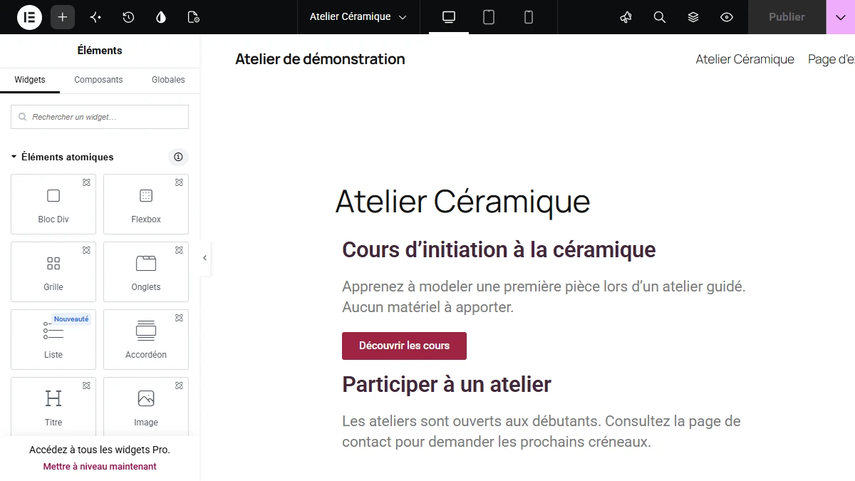
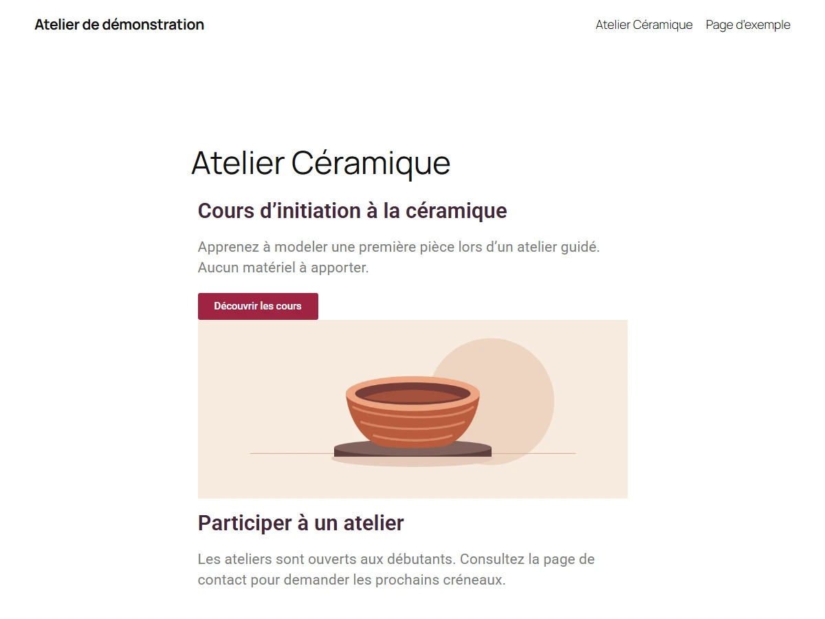
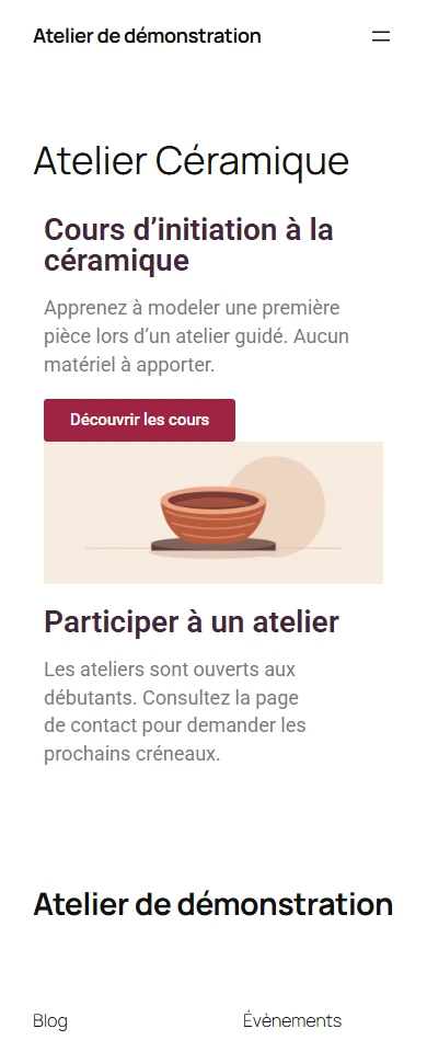
You will publish an Atelier Céramique page: a course introduction, a button leading to the “Participer à un atelier” section and, optionally, an image. The screenshot below shows the result to reproduce. You can replace the examples with your own text as you follow the guide.
The entire exercise uses free Elementor, without a Pro subscription, paid template or code. You can even start without an image: prepare a title, two short texts and the link or contact details you want to present. The screenshots come from a French-language WordPress demonstration installation.
You need a WordPress installation that allows adding plugins and an administrator account. Check that you can see the Plugins menu in the dashboard. If using WordPress for the first time, try this on a local installation or your site’s staging copy. The guide was created with WordPress 7.1.4 and free Elementor 4.4.0. Screenshot labels correspond to that French-language installation.
Before starting on an existing site, open a public page and identify the header, menu and footer. These generally belong to the theme. Keep this page in another tab as a comparison point. The new page will have its own draft, letting you work on its content and check the result before publication.
Install Elementor from WordPress
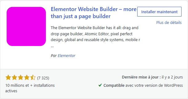
From the dashboard, open Plugins → Add New Plugin. Enter Elementor in the search box. Find the Elementor Website Builder listing published by Elementor. The author name is useful because several plugins add widgets to Elementor and include its name in their own titles. The screenshot shows the builder listing to install.
Click Install Now and wait for installation to finish. WordPress normally replaces this button with Activate. You can also find Elementor under Plugins → Installed Plugins. If the Activate link appears in its row, click it. After activation, the link becomes Deactivate and Elementor appears in the dashboard menu. These two signs confirm the plugin is ready.
If dashboard downloading fails, get the free version’s ZIP archive from Elementor’s official listing in the WordPress directory. Return to Plugins → Add New Plugin and choose Upload Plugin. Select the ZIP file as downloaded and start installation. You can then activate Elementor from the installed plugins list. This route provides access to the same builder.

Move past the welcome screen and set editable content types
Elementor may display a startup screen after activation. It presents templates, services and the option to connect an account. For our page, go to Elementor settings from the dashboard. The menu may group settings under Editor. The first screen to use is the General tab of Settings.
Find the allowed post types. For this exercise, keep Pages checked. On a fresh copy intended only for this exercise, you can leave Posts unchecked because you are building an introductory page. On a site where posts already use Elementor, first record the existing checked boxes and retain types that are part of normal operation. Save with Save Changes and check the boxes after the page reloads.
Default color and font options affect Elementor elements more broadly. For the first page, retain the existing setting and observe the theme’s rendering. You can change the heading and button appearance within the example page. This avoids altering other pages’ presentation while learning.

Create a draft and open the Elementor editor
Open Pages → Add New Page in WordPress. Enter a name you can easily find in the dashboard. The name chosen for this exercise is Atelier Céramique. Save the draft. If WordPress first offers a page pattern, close the choice or select the option that lets you start from an empty page.
The Edit with Elementor button appears in the WordPress editor when the page belongs to an allowed content type. Click it. Wait until the elements panel and page preview are ready before starting. If the button is absent, return to Elementor settings, check Pages and reopen your draft. Also verify in the plugin list that Elementor is active.
The title entered in WordPress identifies the page and may be displayed by the theme. The heading you add in Elementor is a content element. Depending on the theme, both may appear on the public page. We will check this in the preview, where the result is easier to read than through settings alone.

Choose the layout and understand the panel
Identify the elements panel and the area displaying the page. Use the panel to choose an element, edit its content or adjust its appearance. The preview area shows element order and dimensions. When open, the structure panel helps find a small element or one inside another block.
A theme-provided layout is a good starting point. It retains your site’s navigation and footer. If the theme restricts page width too much, try the Elementor Full Width template, then check that the menu and footer remain present. Elementor Canvas is designed for building on an independent canvas. Use it if you need a page without those navigation elements and check the result in the preview.
For a service page aimed at site visitors, retain access to the rest of the site. Observe the current template first. You can then return to the previous template if the change reduces readability or removes something useful. This check happens on the demonstration page and does not require changing the entire theme.
Plan the page’s two sections
The first section introduces the course. Use a precise heading, such as Cours d’initiation à la céramique, then a sentence explaining what the visitor will learn. Add a button leading onward. On a phone, a short sentence lets the button appear quickly.
The second section answers the reader’s next question. In our example, it is called Participer à un atelier. State how to request a place or obtain information. The first section’s button aims to lead to this section. On a real site, you can also direct it to an already published contact page. Choose the destination before setting button colors.
Imagine stacked boxes: a container groups a section’s elements; a widget is one of those elements, such as a heading, text or button. Keep a single column for this first attempt. The heading, text and button will read in the same order on desktop and phone.
Add the first container and its elements
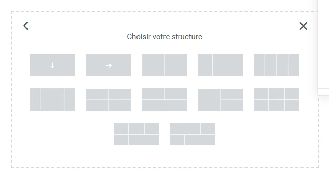
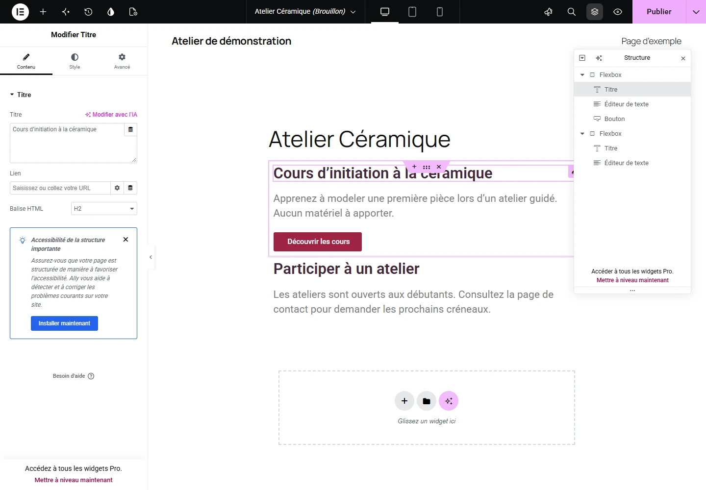
Click the + in the page’s empty area. Choose Flexbox, then the vertical, single-column layout. The new frame is a container. You will place the heading, text and button in it, one below another. If you open the Structure panel at the top of the editor, you can verify that these three elements are at the same level inside the container.
In the left panel, find Basic. Elementor 4 may also present an Atomic Elements group with some identical names. To follow this tutorial’s screenshots, use Basic widgets. Click the small + in the center of the empty container, then click the Heading widget in the panel. You can also try dragging it directly. Click the heading placed on the page to find its settings, then replace the sample text with Cours d’initiation à la céramique.
Next add Text Editor beneath the heading. If you prefer adding by clicking, first select the heading on the page, use the + in the top bar to return to the widget list, then click Text Editor. Check in Structure that it sits immediately after the heading in the same container. Enter, for example, “Apprenez à modeler une première pièce lors d’un atelier guidé. Aucun matériel à apporter.”
The heading level depends on what is already displayed. In our example page, the theme shows Atelier Céramique as the main heading. The course heading can therefore be an H2, like the second section’s heading. If your page has no visible main heading and the course title fills that role, choose H1 for this widget. Text size is configured separately under Style. You can therefore emphasize a heading without changing its place in the page hierarchy.
Create the second section and connect the button
Add a second container below the first. Place a Heading and Text Editor widget inside it. Enter Participer à un atelier as the heading. In the text, explain the visitor’s next step. For an exercise, “Les ateliers sont ouverts aux débutants. Consultez la page de contact pour demander les prochains créneaux” is enough. On a real page, add the link to your contact page or another contact method already in service.
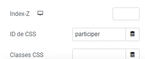
To let the button point to this section, click the Participer à un atelier heading. If selecting it is difficult, open Structure and click the second container’s Heading widget. Open the Advanced tab and find CSS ID. Enter participer, without spaces or the # sign. This ID must be unique on the page. You have given the section heading an internal address.
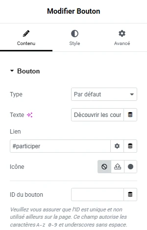
Return to the first container and add the Button widget beneath the text. In its Content tab, enter Découvrir les cours in the text field, then #participer in Link. The # appears here because you are pointing to a section of the same page. The button text should remain understandable out of context. “Découvrir les cours” says more about the destination than “Click here.”
Another approach applies if you already have a contact or booking page. Paste its address into Link, then open the destination in preview to verify it exists. The button can thus be useful from your very first page. No Elementor form or additional module is needed for a link to an existing page.
Add an image from the media library
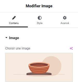
This step is optional. Place the image below the button so the first action remains easy to find, even on a small screen. Choose an image showing what the visitor will discover. For the workshop, the example is a bowl on a potter’s wheel.
- Select the first container’s button, then click the + in the top bar to return to the widget list. Click Image under Basic and check in Structure that it appears immediately below the button in the same container.
- Click the Image widget, then its thumbnail in the left panel. Choose an image in the Media Library or open Upload Files → Select Files to add one from your computer.
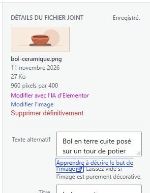
- Select the file. In media details, fill in Alt Text if the image conveys information. Example: “Bol en terre cuite posé sur un tour de potier.” A purely decorative image can leave this field empty. Confirm the selection to return to the editor.
- Preview the page. If the file is very large, prepare a smaller version before uploading. Check in mobile view that the image fits the column and the button stays above it.
Adjust spacing, text and the button
Select the first container in Structure. In Edit Flexbox, open Style, then Spacing. In a classic container, look for padding under Advanced. For a block whose background should surround the text, try 24 pixels of padding on every side. On a phone, reduce this if text lacks space. Padding separates content from the block’s edge. Margin separates the block from neighboring elements.
For the button, open Style and consider text and background colors together. For example, white on dark red creates an easy-to-find cue on a light background. Check the button at rest and on hover. On a phone, allow enough space around it to reach it with a finger. If changing heading typography, also check the second section, which must remain easy to identify on the same page.
These settings can stay local to the page. For a first creation, you can retain fonts and colors inherited from the theme and limit changes to spacing. When you want a shared palette across several pages, start by recording your site’s colors and test on a copy. You will then be able to distinguish a widget change from one applying to the entire site.
Check the page on desktop and mobile
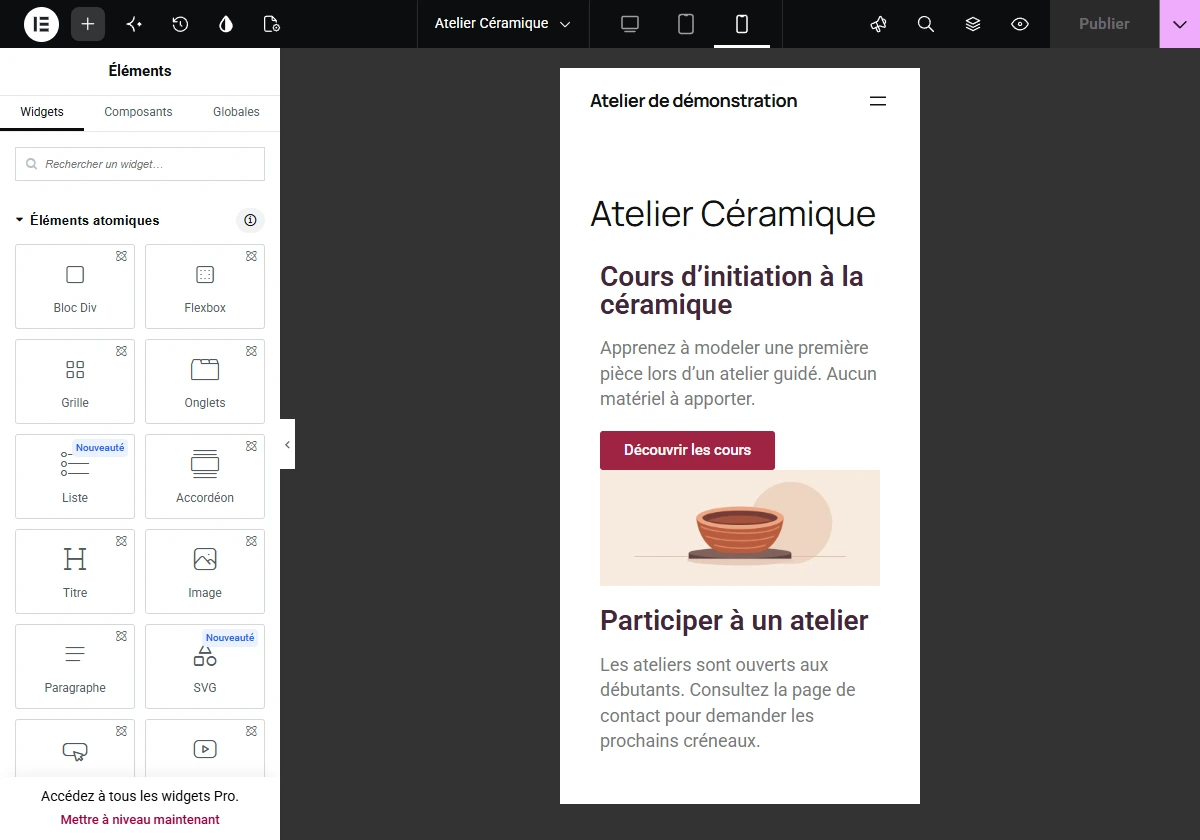
In the top bar, switch from Desktop to Tablet Portrait, then Mobile Portrait. In mobile view, read the page from top to bottom. Look for an overflowing heading, text too close to the edge, a hard-to-reach button or disproportionate empty space. A heading split across two lines can remain very readable. Drastically shrinking it to fit on one line is generally unnecessary.
If a setting displays a device icon, check the selected mode before changing its value. For example, you can reduce padding on mobile while retaining the desktop value. Then return to desktop mode to verify that the wide presentation still suits you. Fields without a per-device setting may apply to all views.
Open Preview Changes. On that page, click Découvrir les cours and verify that the Participer à un atelier section appears. If the button leads nowhere, first check the pairing of #participer in the button and participer in CSS ID. Also try reaching the button with Tab, then activating it with Enter. The preview helps check these interactions away from editor handles.
Publish and check what a visitor sees
When ready, click Publish. To continue later, open the options beside Publish and save the draft. For an already published page, the main button saves changes to the public version: open the preview first if you want to review them.
Publishing a page does not automatically add it to every navigation menu. If it should appear in the menu, add it through your theme’s navigation settings. With a block theme, navigation is generally under Appearance → Editor. With a classic theme, look for Appearance → Menus. Skip this step if you only want to share the direct address.
- Open the public address from the Pages list, then copy it into a private window while logged out of WordPress. Check that you see the page, its menu and footer.
- Click the button. It must lead to the “Participer à un atelier” section or the chosen contact page. Check that contact details and links are final before sharing the address.
- Repeat the test on your phone if possible. Read the heading, open the link and check that you do not need to scroll the page horizontally.
Resolve common obstacles and decide what to do next
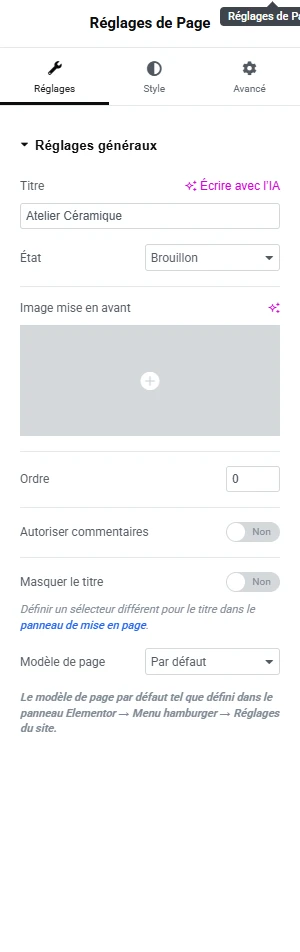
You see two headings. Open Page Settings in the top bar. If the theme supports it, Hide Title removes the automatically displayed one. Preview the page after this change. If the theme still displays it, keep its title as the main heading and adapt the Elementor heading, or compare available templates on the draft. Retain a visible main heading and clear section hierarchy.
The editor and public site display different versions. Check the address and publication status. After a change, save the page and compare again from a private window. If the old version persists, clear this page’s cache in your caching tool, then repeat the test. Check on a draft or copy before disabling an active plugin on a live site.
A widget asks you to upgrade. Return to Basic to find the heading, text editor, button and image used in the guide. If you want to collect messages, the WPForms Lite tutorial at the bottom of the page shows how to create a free form and verify that a message reaches your inbox.
You now have a page you can adapt for a service, association or local activity. Before adding new elements, replace the demonstration text, check the button link and reread the page on a small screen. These three checks matter more to your first visitor than the number of widgets present.
Undo a move or recover a saved version
If you moved the wrong widget, open Elementor’s editor history before rebuilding the page. The panel distinguishes session Actions from saved Revisions. The former let you undo a recent manipulation; the latter let you compare a saved version. The available list depends in part on WordPress revision retention.
On your draft, choose the state before the mistake and check the heading, button, its link and the two containers’ order before confirming. Restoration may remove other changes made after that state: keep recent text you want to retain separately. Then review the mobile preview and save only when the result is suitable. This history concerns the page; it does not replace backups of the site, theme settings or deleted media.
Sources and references
Use these references to check the features, requirements and limitations described. Reading documentation is not a practical test.